INITIAL IDEAS
My initial ideas for my print information pack are all shown below throughout my development. When I was at home and I took photographs of things I found inspirational I also wrote down all of the ideas that came to mind at the same time. A lot of the things I found inspirational were connected to nature in one way or another. They were also promoting the notion of being eco friendly and reducing the negative impact on the environment.
I therefore started to think about creating a book which would introduce the idea of creating eco friendly graphic design, trying to change the way in which the industry works now. I considered how I could create a book which could be bound using the stems of leaves or fake leaves, print the book using vegetable based inks, and then have a section at the end of the book which would explain how the book was made. I also liked the idea of creating little bookmarks all the way through the book which were part of the pages and introduced a new section of the book. I will be experimenting with this when I start to create prototypes.
I also considered whether or not it would be necessary to include absolutely all of the different processes, because depending on the audience, it may not be necessary to include them all as they may not all be relevant.

I then decided to start drawing out some of the ideas I had for this brief. I have clearly annotated all of my ideas along the way to help me to understand whether or not each one would be successful.
I was inspired by my secondary research online as well as the primary research I carried out at this stage, and so there are a wide range of ideas and routes I could go down. I thought about creating something quite detailed and hand crafted, by taking the idea of having a 3 dimensional box which would represent a printer or something along the same lines, and then the user would open the printer to reveal all of the different books containing organised information. On the other hand I considered creating something much more corporate and professional looking, which would be presented in the same way as the 101 practical household uses book (taken from my primary research).

I then started to consider how I could possibly make my pack interactive, by providing the user with labels on each page which can be taken from the back and then act like page markers. Or I could even create a box which contains a set of leaves (in the shape of leaves) that also represent the correct terminology for pages. This is where I begun to think about my underlying concept, to 'take a leaf out of my book' or to 'turn over a new leaf' by encouraging people to be more eco friendly where graphic design is concerned.
All of the decisions I need to make refer strongly back to the audience. At the moment I am thinking that my audience would be either graphic designers or printers who need to be informed about how they can be 'greener'.
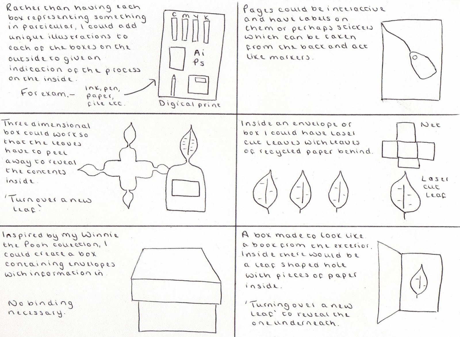
Most of my ideas at the moment are all obviously if not loosely linked to leaves and nature. They are also fairly complicated and consist of the user having to collate the information together themselves, this is something that would have to be simplified slightly in order to encourage printers or graphic designers to use it.
I really like the idea of having a page at the end of each process or book that I create which contains seeds to grow leaves/fruit/vegetables to make your own inks.


Here I tried to think of some more simplified ideas, such as taking a concertina design and placing it inside of a laser cut leaf. Therefore the concertina itself would be quite simple to read and the only complicated part would be the intricately cut cover.

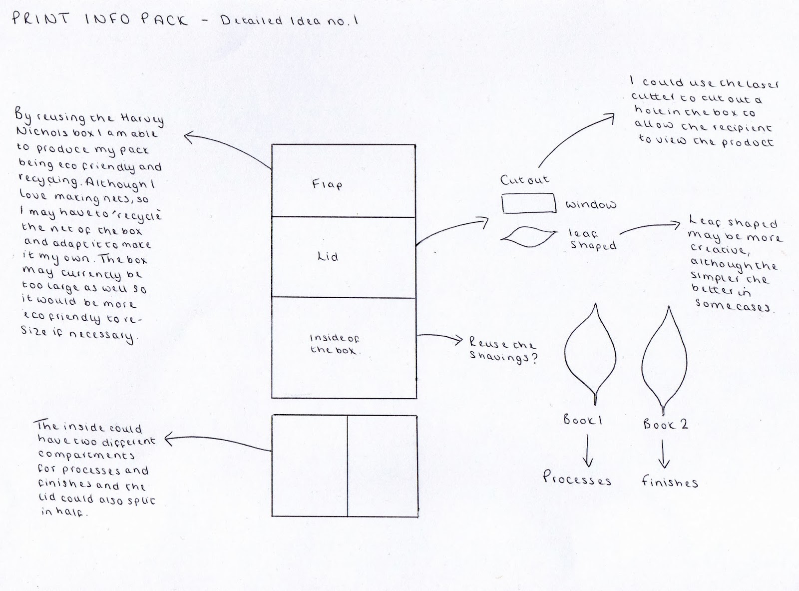
I then decided to draw out an idea enlarged with a bit more detail. Using the Harvey Nichols box and recycling it for this brief, I thought I could produce a book or a set of books which could be placed inside of the box, and create an open window which the user could look through to view the product before opening it up. This would be one way of me being eco friendly, however I am not sure whether the content would justify the size of the box.

During my print and web crit with Phil, it was suggested that I should try and aim my print information pack at children and parents (families) who could perhaps use the pack to consider the more eco friendly ways of designing. I really like this idea at the moment, however there are some flaws in this idea because I'm not too sure how much children would consider the environment, and whether they would understand the underlying concept of 'turning over a new page'. If I decide to change my target audience and make it more defined in this way then I am going to have to carry out further research into families and whether they would find it helpful or not.
CONTENT
The content at the moment would be based around using vegetable based inks, recyclable paper and a net or design which would require using the smallest amount of material possible to produce, this way it would be cheaper to reproduce in the real world if applied to a real life situation.
PROTOTYPES
Using the book below as well as one I already have at home, also called packaging templates, I went through and selected some of the nets which I felt would be suitable to answer this brief. I always find it easier to experiment with things like this at the start of a brief as it helps me to get even more ideas and develop any ideas I already have.

The image below is taken from the book above, demonstrating how the spiral design is used to present the information in a more fun way. I thought about using this net and developing it so that the circle would represent the earth, and in turn would also reflect the idea of a 'greener' world. I printed a variety of nets to start with and then started to make them in no specific order, but when it came to this one I had already decided that it would perhaps be a little bit too fiddly and not very appropriate for me to apply information to it as there is limited room for text.


This is the page marker idea I mentioned earlier on in my development when I drew out all of my ideas. This is inspired by the Chanel perfume blotter I picked up not so long ago, which I have also blogged as inspiration. I did a quick mock up of what this would look like using the shape of a leaf. If I was to develop this and use it for my final piece of work then I would obviously use a laser cutter to make it more accurate. However, thinking about it, the book would have to be really quite full to make the page markers necessary.


This net is simple, easy to fold away and perhaps one of the more practical ideas I have thought about. Although I like to make things complicated for myself, I do need to start thinking about the more practical resolutions.

I also experimented with the idea of having a box created using a simple net, and inside all of the information would be contained perhaps still using the idea of the leaves cut out.


I also tried cutting out the shape of a leaf and placing paper in between which would be in the format of a concertina if produced properly. I like this idea because it isn't too complex and I think it would be a suitable way to present information.


In the same way that I want people to turn over a new leaf, I thought I would reflect this in the design of my work as well. Here, the circle can be turned around to reveal the information on the other side.


This is a smaller prototype of the leaf concertina I made earlier, I still really like the idea of creating a concertina, it would also be much cheaper to reproduce as well, as I wouldn't have to consider the binding methods.


CONCEPT DEVELOPMENT
As my ideas so far are quite complex and hard to reproduce, I felt as though it was important to narrow down my decisions and create something with a bit more of a focus to it. I therefore had a mini crit to dicuss my options. In this crit I asked 'WHO AM I? WHY AM I CREATING THIS INFO PACK?' where I decided to create a leaflet (mailshot) which would be sent out as a non profit government awareness scheme, therefore addressing small businesses and independant professionals, or perhaps graphic designers (but this is probably too vague and not as challenging for me).

I then considered how children don't print using all of the processes, and therefore creating an information for children and families would be pointless, unless I was to supply them with necessary equipment for certain procedures. The format of my mail shot could be in the format of an envelope or a box, perhaps like a graze box (or the same method of distribution - fill out a form and receive the information in the post). At the moment my idea is very hard to reproduce, using vegetable based inks and perhaps applying them by using wooden blocks. This wouldn't be practical when mass producing.
I have also realised that it is important to imagine anything I produce, to be used professionally. Therefore it wouldn't just be conceptual, but it would be applied with the possibility in mind that it would be used in the industry. It therefore needs to be easy to reproduce and cost effective. This refers to my post (see design for print and web crit with industry professional).
PROGRESS REVIEW
I am at a stage now with my work where I have developed my idea considerably, as it has changed from being a complex print information pack for designers/printers, to a pack for families, and now a non profit organisation government awareness scheme who send out information to printers trying to persuade them to use more eco friendly vegetable based ink printers and recyclable paper.
In order for me to produce this however, I must carry out further primary research, as I do not have enough to work with at this moment in time, and I would be guessing rather than making informed, researched decisions.
I am going to visit a few different printers in Leeds to get feedback from them, and make separate blog posts about this to demonstrate my research and my decision making.

Having now visited LGP as well as the smaller printers such as Hobs reprographics and Fast Signs, I am now able to continue with my work. I have now realised that my previous idea wouldn't work, because essentially the clients going to the printers don't care about the environment as much as they should do, and as a result, they just want the cheapest option available. I have tried to continue experimenting with different formats to use below.
LGP LEAFLET DEVELOPMENT
Since visiting LGP and making this brief into a live brief for myself, I need to now consider the format of the mail shot I will be producing, and would like to experiment with a variety of different ideas before settling on the final one.
I like the idea of creating a leaflet which is small enough to receive in the post without it feeling overwhelming. Here I have taken an idea from one of my books and created a net which folds out to reveal all of the information inside, it also acts as an envelope when sealed.
Initially, I had thought about creating a sample pack but since receiving the samples I have decided against this idea (see mail out idea post).


This idea is quite similar to my previous one, and I think if the shape was adapted to not represent a briefcase or suitcase, then it would fit the brief quite well. I'm still not convinced that this is even simple enough though and I am wanting to develop my idea even further.


Inspired by GFSmith, I experimented with recreating one of their booklets by using paper alone. This would be cost effective, reducing binding costs, however it would be quite complex to reproduce and make each one individually as it would have to be done by hand not machine. I love the concept of using a book which binds itself however and would possibly use this in the future for another brief if suitable.


I decided to print out a couple more nets but then realised that once again these would be quite hard to reproduce and would take longer as well. LGP need something which is quick to print, quick to fold or bind, and quick to distribute. I therefore decided against making all of the prototypes because I could see once I had printed them that they wouldn't be suitable and appropriate.


This net is supposed to be cut out in the sections printed, so I could make this even more relevant to my brief. Although this would be hard to reproduce as it would have to be cut out specifically every time it was printed.

AUDIENCE
Rather than simply continuing with prototypes I thought it would be worthwhile to write down some key points and make some decisions on paper. First of all, most importantly, I need to write down the audience, and understand my reason for creating this leaflet for LGP.
Below is a flow diagram I created to help myself understand who the audience are and why they would need information about all of the services LGP supply to their clients. Essentially, once I have completed the design work for them and have handed my work in, (or perhaps beforehand), Phil from LGP will be able to decide who exactly to send it out to, and it would more often than not be sent out to clients who have recently contacted him about a job and would require more information perhaps.Or even something clients could take away with them after collecting a print job, to remind them in the future of their services.

The ideas below illustrate different ways in which I could create a concertina. I thought about creating it so that one of the folds is slightly bigger with a tab on it saying LGP. Or I could even create a folder in a similar way to the examples I have picked up from LGP. I do quite like the idea of having several different folds and different containers for all of the pieces of information. This is something I would like to experiment with further in my development.

Using the LGP website I then wrote down all of the possible content I could include. When writing down everything on the website I came to realise that I may not necessarily need to include all of the body copy as not all of it will be as useful as the rest. It is clear from this image that my thought process changed throughout me writing ideas down, and I started to think about a possible different format to use (GFSmith booklet) instead of a concertina.

I then wrote down all of the pros and cons of using a concertina and adapting GFSmith's booklet idea. I decided that the concertina most definitely had more pros and that I should use this for my final printed resolution.

With the concertina decided, I drew out a few more ideas for the layout of it. I thought about creating a set of concertinas as opposed to simply using one, but I think this is too much to be sending out to clients and they wouldn't want to read that much text. I then thought about how each of the letters could stand for something, this would be one way of separating the information up. However, once again I think this is getting a bit too deep and it just needs to be as simple as possible.

Having asked LGP for information about their ink suppliers, I thought it might be quite appropriate to create just one other concertina alongside the main one which would supply the client with specific information regarding ink and sustainability. I considered how this could be presented in the shape of an ink droplet. I also looked at how I could create a concertina for the glossary and the front could have the A printed on it with the Z at the back, and a line running in between to represent the dash. Then started to play on the idea of the A and the Z working together to form a kind of logo.

This is just a really rough attempt at me trying to make my concertina fit on to the page to see how much space I would have for each of the sections of information. I used this as a template to work out whether or not it would work and whether I would have to print it at A4, A3, or A2 scale. This is something I need to look at it more depth to ensure that the final resolution is successful.

I have just made this concertina which I feel is probably too simple to use for my final leaflet. I can always just adapt it slightly however, to become a little bit more complicated if I feel as though it is necessary. I would like to experiment with making the net for the leaflet a bit more complex and interesting to hold and read.


Although this doesn't have any of the printed information on it, I think I could quite easily work with it for my final design. I like how there is a plain leaf, followed by one with a pouch to put different pieces of paper in to, and then a fold down piece of paper to contain even more information. The final leaf acts as a small envelope in which a concertina could be found, or individual pieces of paper. The only problem I am having at the moment with this idea is the fact that when I fold it all up it doesn't close as well as I would like it to. If I decide that I want to proceed with this idea and develop it further I can easily adapt the next and allow more space in between each of the folds to enable it to close easily.

This is what the same net looks like with a piece of paper slotted in to the pouch. However if I was to print on to the leaflet, this sized paper wouldn't be big enough as it would have to cover most of the background area and removed to be read. Once all of the pieces of paper are removed it would reveal the text relating to all of the different services.

This is what the concertina looks like with all of the text I would need on it. I am still not at all happy with the layout of this as it looks extremely cluttered. I would be happy if I was able to take some of the information out. At the moment it looks as though the 'Environment' section is unnecessarily long and doesn't need the additional fold.

Here I have added another leaf to the concertina. I felt as though I was limiting myself in terms of space for all of the text and so decided to increase the length of the design. Any longer would look a bit too complex I think.

Here I have simply removed the excess fold on the final piece of paper. I felt as though it was unnecessary beforehand, and when I tried to put the paper in to the little pockets, the pocket would come away and wasn't secure enough to stay in place. I could have improved the way in which I created the pocket but instead I have decided to develop the net even further by simply putting small slits to allow the paper to sit in them neatly.

The image below demonstrates how this would work if I was to develop this idea and use it for my final leaflet. I am not convinced this is appropriate and feel as though I need a second opinion. I think once I am satisfied that I have created enough prototypes to compare and criticize then I am going to ask for a second opinion on this work.

Rather than having too many pieces of paper that fold outwards or down, I have decided to adapt one of the pages so that it has a miniature sample envelope and page which would have all of the dimensions printed on it. I really like this idea and think it adds quite a unique feature to my work, but I am really not sure it is suitable for LGP and whether it would be easy to reproduce because it would involve printing lots of separate pieces of work, setting up lots of different printers and then collating all of the work together manually. This is something that LGP won't have the time for when they have other jobs to complete for deadlines for their clients who come first.

Below are some of the screen shots I have taken whilst making progress with my work. I have demonstrated use of grids and have tried to maintain consistency throughout all of the different designs. I found it fairly simple creating all of the different nets because it was simply a case of adding or removing folds to simplify the design.


CRIT
At this stage I feel as though I am ready to ask for second opinions on my work. I took it upon myself to ask peers as well as an industry professional whether they thought what I had produced was appropriate and answered the brief to create a promotional leaflet for LGP.
I received some really valuable feedback and was told to simplify it a lot. I was quite disappointed at first that I was going to have to simplify the word I have produced so far, but at the same time I appreciate that the feedback is extremely valuable and can't be ignored. I was beginning to think myself that I was getting a bit too carried away with making it more and more complicated, and it wouldn't have been easy to reproduce at all.
FURTHER PROGRESSION TOWARDS MY FINAL DESIGN
Using an A4 sheet of paper I therefore decided to draw out some further thought processes. I worked out that if I was to separate the information up on to eight leaves of paper in total, this would allow me to have enough room without the information looking overcrowded.
Using the website I have decided to take the relevant information off there to create the leaflet, but perhaps simplify it even more and not include all of the information. For example, I don't think it would be necessary to design a glossary again because it is supplied for the client on their website, which will be listed on the leaflet anyway.
I worked out that if I use an A2 sheet of paper I can fit four concertinas on to one sheet which is eco friendly and sustainable. This relates back to my initial developmental work when I was wanting to create a more crafted and intricate resolution to this brief using leaf ink and vegetable based inks.
The sheet below also explains how I will organise all of the information succinctly. I feel as though the feedback I have been given has allowed me to gain more direction with my work as I felt as though I was going off on a tangent slightly.

At this stage of my development I have realised that all of the prototypes I have made previously and all of the ideas I came up with were far too complicated. I therefore wrote down a quick plan of everything I needed to do in order to make my concertina a success.

Below are the dimensions I have decided on for my final concertina. At first I looked at the Royal Mail sizes to make sure that I was creating it all to the correct scale, but then I realised that LGP have their own dimensions for envelopes and so this would be more appropriate to use and apply to my work.


I then started to look at working digitally again and applying everything I have thought about on the computer. The image below is of a very rough prototype which I came up with, simply taking some of the colours used on the LGP website and applying them to print. I have also shown what my design looks like on screen before print.


This is an example of what the leaflet would look like using just the LGP green alone. I am not sure whether this is striking enough or not though and think it needs some more colour to make it a bit more consistent.

When working on the envelope net I decided to make it as simple as possible. Below is one of the first attempts I had at making the envelope to the correct scale, with a mock up of my leaflet inside of it.


I then applied the LGP logo to my envelope to personalise it a bit more and added a space for them to write all of the addresses out. I have since realised however, that they are more likely to print out stickers with all of the addresses on instead because it is more time consuming to write them out. Therefore I am not sure if this box is even needed at all.


Here I have used the illustrations taken from their website and drawn over them myself to create simple line drawings which can be applied to my concertina. I am pleased with the outcome and feel as though the illustrations will help to break up all of the information in my concertina.


I also considered how I could do the same for the binding, however I am not sure I will be able to do this due to limited space and also making it look a little bit too overcrowded with illustrations.

Once I had designed all of the art work for the concertina I then had to print it out on two pieces of A4, and this is what it looked like. I was then able to create a prototype of what my leaflet will look like at the end.


I then printed the leaflet out in small scale just to see what it was like. I am really pleased with the progress I am making and hope that LGP are happy with the outcome. At the moment it feels as though something is missing and it looks a bit too text based, hopefully I will be able to get hold of the images from their website to use them.


APPLYING IMAGES TO MY CONCERTINA
I asked LGP if they could provide me with the images from their website so that I could apply them to the leaflet. I then tried placing them on my document in a variety of different ways shown below. Some are quite obviously more successful than others.
Here, I tried placing the image in the background and drawing an orange text box out with white text over the top, I did this so that it was easier to read than having to see the photograph through the text. I am not sure whether or not it works in this colour though.

I tried it again but using another bright colour. This didn't work either and it made me realise that using the bright colour as a large background box doesn't work and it can only be used for certain text without it looking too overpowering.

Instead I then tried using a white background with the black text and the colour used for the heading and stroke. This was much more successful and I am quite pleased with the outcome. However, I don't like how the image in the background is mostly covered up and can't even be fully understood because it isn't really clear what it actually is.

I then tried applying the images to the background and reducing the opacity thinking that this may be more successful, but it wasn't really. I think that by reducing the opacity so dramatically it actually ruins the quality of the photograph and doesn't really tie in with the website anymore. This is something I won't be doing on the final design.

I then tried placing one of the images on the cover of my concertina instead to see if this created impact. At first I placed the LGP logo over the top of the image with the white background and it didn't really look right at all.

I then removed the white background on the logo and instead made it white, then imported it to InDesign. This worked much better and I really liked the outcome. I thought it would make sense to perhaps use the images a little bit more sparingly rather than trying to use an image on each of the pages. I placed one on the contact page but didn't think this one worked very well.

I then incorporated the photograph which resembles embossing and placed a white box behind the text to see whether it helped it to stand out a little bit more, but it didn't look right.

Before making a final decision regarding the images in the background I thought I would try the middle two pages with the same image stretched in the background, I didn't think this was necessary though and prefer the negative space in between the front and back cover.
Instead I then resorted to using the same photograph on the front and changing the back cover to a striking red image. I thought the contrast worked really well and I am pleased with this layout.

No comments:
Post a Comment