I have always wanted to get involved with designing wedding invitations and so when my friend asked me about designing her save the date cards I was really enthusiastic and excited about this brief. She sent me an email with all of her initial ideas so that I could start working on it as soon as possible.
When Lucy first contacted me via email she informed me of a few ideas she had and sent me a quick slide show illustrating her ideas and providing me with some initial imagery to worth with. This was really helpful as I could get a feel for what she was wanting to see on the end design.
There were two routes she wanted to explore; the idea of a fun and quirky postcard with their heads in the wooden cut outs shown on the first image, or something which looked a little bit more like the festival flyer, with a bit more of a corporate feel. I personally thought that the more corporate design would work really well, but also thought that the other idea had a lot of potential, although it would be hard to produce without it looking unprofessional. However, I do know that the wedding isn't going to be a very traditional wedding and will be more like a party, so this is something to keep in mind.
Below is the email I received to start with. There were a lot of different routes I could take design wise, however before inserting any photographic imagery of them both I wanted to experiment with the general feel of the design first and get that right before trying to work the images in to the postcard design, as this may not even be very successful.


Although Lucy provided me with some imagery to work with I felt it was important for me to do some more research myself, so that I could potentially get some more inspiration. As I didn't have much time to do the initial research, I simply did a search online. Had it been a situation where I had more time I would have visited shops and taken photographs of inspirational designs. I do as though the internet was sufficient enough however, as the save the date card which I created is very bespoke and personal to the couple, and especially as I have been provided with such specific imagery to start with, I felt as though I had more than enough to work with.
I have shown all of my research on my context blog and it is clear from the research I found, that I have been able to take inspiration from certain designs and apply the same sort of effect on my own design work.
Using all of the above images I then developed a variety of different design ideas to present to Lucy. I wanted to try and experiment and create some designs which are quite corporate and professional looking, but also create some designs which are more fun and informal.
I had a go at some hand rendered drawings as well and thought it would be quite personal if I added some of them in to the designs. I will have to see if any of them are suitable when I start designing digitally.

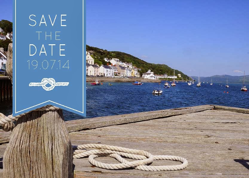
Here I have taken inspiration from the festival leaflet and have adapted the drop down block colour with the pointed edge. I feel as though this gives it a friendly feel and almost looks like a ribbon dropping down from the top of the page to give an added feminine touch. I have also incorporated the rope (as suggested in her ideas) and I hand rendered the 'tying of the knot' to give it a personal and rustic feel.


Once I had sorted the layout of this design I then experimented with the typeface and the line around the edge of the blue tab. I wasn't entirely convinced as to whether Lucy would prefer a sans-serif or serif font so thought it would be best to supply her with both so she can make that decision.


I then took an entirely different approach and went for a more minimalist look. Illustrating an anchor in the centre links the design to the seaside but in a more subtle way.

Here I experimented further with the idea of using illustrations. I feel as though they complement each other really well and separate the text up so that it is easier on the eye.

By simply adding a border, the design now looks more finished and desirable. I am hoping that Lucy agrees when I send all of these files to her.

Using the knot alone, the text fits around the image really well and could work in the centre, as shown here or even increased in size to fill the postcard.

Having sent all of these ideas to Lucy I then waited for feedback to allow me to make further progression. When I received the feedback I was slightly disheartened because I thought she would probably be happy with one of the ideas and that she would want to take one of them further to eventually become the final design.
Instead she responded to my email explaining that her and her fiance had had a go at putting something together to help me to understand what exactly they want. They had obviously put a lot more thought into the design by this point. She did say that she realised the design had changed a lot from the initial idea and didn't want to take up anymore of my time if I had other work to concentrate on, but of course I wanted to see the project through to the end.
She attached the images below and said "Anyway, I have attached one slide with notes on (hopefully these make sense) and an idea of the back - it would be awesome if the line around the edge could be the rope idea you used in your ideas. The photo on one slide is the one we've taken our heads from!"
The notes on the following image are self explanatory and she has tried to make it as straight forward for me to do to speed up the process. I feel as though if I had known this from the start then it could have been completed a lot sooner.
At this stage in the development I am concerned that some of the images won't be a high enough quality to use for the final design. I have mentioned this to Lucy but she has searched for alternatives and there aren't any which are suitable.

The back of the postcard is very simple with not a lot of detail. I personally think it would benefit from having a small illustration on it, but I will have to experiment and see.


I responded to her email with the following design ideas. I found it really hard to make it look presentable because it is very different to anything I have designed before, and I usually work in a much more minimal way, but it is definitely teaching me to step outside of my comfort zone and understand that it is what the client wants that matters.
I explained what I had done on an email...
Although this isn't what I would usually design, I can appreciate how it relates to the seaside strongly and how playful and fun it is. I experimented using a font which is made up of a rope, as well as a serif font, and spent quite a while cleaning the central image up to remove the text overlaying the image.


I thought it might be quite nice to reverse the colours on the back and have the blue in the background, however since sending it I have realised that this isn't an idea colour to write on with a black pen as it wouldn't show up very well, so I am either going to have to reverse the colours back or use a lighter shade of blue instead.

I then heard back from Lucy and she asked me to make some more tweaks to the design and then said it would be ready to send to the printers. The updated designs are shown below and the changes are quite obvious.


When I heard back from Lucy after she had consulted with the printers, she explained to me that she had had a few printed and that the images weren't high enough resolution. This is something I had already anticipated earlier, however she was sure that they were the photographs that she wanted to use.Unfortunately this meant that, due to the limited time, they had to pay for some high quality images of Aberdovey and use them instead. The job ended up being slightly rushed at the end, and the image which I had edited on Photoshop couldn't be used because it was too blurry. Lucy and her partner then ended up using a template to place the images ready to print. This meant that when I received my Save The Date card in the post it looked completely different to what I had originally sent.


Evaluation
I feel as though if I had been given an extra day to tweak the design for the printer, then I would have been able to provide them with a design which was not far off the one they wanted. If I had been working on this brief from home it would have allowed me to have more regular contact with Lucy, however I do feel as though we were able to manage the work and give regular feedback via email. I feel as though I have learnt a lot from this brief, because I have not only worked for a friend and realised that it isn't always as straight forward as anticipated, but I have also been able to experience first hand that the client is 'always right' and as frustrating as it can be, sometimes it means waiting for the end result to realise that it isn't going to be as successful as originally planned (in this case with the image quality). I am pleased I saw this brief to the end though, as there were many times where I was told by my client that she would complete it if I didn't have enough time with the rest of the work I had on. But that is all part of being a graphic designer, and turning clients away in my opinion is like throwing an opportunity away, because no matter what the end result is, there is always a lesson to be learnt.
No comments:
Post a Comment