Whilst I was at home over the weekend I carried out some primary research. I was struggling to think of a unique idea for the print info pack to start with and so I thought it would be beneficial to not only browse the internet but also try and get inspiration from objects around me. Below is an image taken at home. All of the autumnal colours made me think about nature and the environment as well as being organic. This made me think about whether I could perhaps link it to the environment in some way.
I also came across this book whilst I was home, which I thought linked quite closely to my previous thoughts linking to nature. As this is a book which uses natural remedies for cookery, health and beauty, DIY as well as gardening. I particularly like how clean and minimal the cover is, but I also really liked how the tabs are used to separate the chapters. This has also been done very subtly with a slight difference in the shade of colour.
I also came across this gift box which I had kept for quite a while, mainly because I liked the design of it. I had bought perfume online and it arrived in this box with the brown shredded paper inside. This instantly made me think of organic design too, but it also sparked off an idea that I could perhaps reuse and recycle this box in some way when creating my print info pack. I also think the closure works really well as it is hidden and neat (magnetic) and therefore the recipient will wonder what is inside as they can't currently see in. The only way I could perhaps adapt the box to make it my own design is to perhaps laser cut it in some way, or make a window on the top with some clear plastic or a suitable material allowing the recipient to view the product inside.
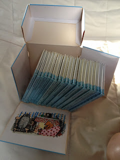
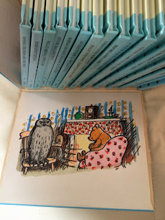
When I was given the brief I instantly thought about this book collection I have had since I was little. I think it is a clever way of packaging a set of books in a creative way. As the lid opens up the sides fall outwards as well, allowing the books to be easily accessible.
I also visited Cedar Farm nearby to where I live as I always seem to find inspiration when I go there. Often I am inspired by simply having conversations with the staff that work there, or I come across examples of design which trigger new ideas in my head. Unfortunately I didn't feel overly inspired by anything in particular but when I arrived there in the car I took another photograph of a tree through the window, indicating that I was subconsciously thinking about earlier on in the day and trying to make the connect with nature when thinking about this brief.
I then went to a cafe nearby to Cedar Farm for lunch, called 'Yours it the earth'. The branding reminded me of an eco-friendly place and the chosen typeface is quite hand rendered and organic. Whilst I was sat
Whilst I was sat waiting for my food I had a look at some of the printed materials on the table, and came across the one below promoting their award winning pies. I got the impression that the designer had tried to portray a green, eco-friendly design which also had a bit of a fun element to it (illustrations) however I thought that the text in the speech bubbles was hard to read. I thought it would be worthwhile photographing this though, as it will remind me not to do this in the future.
Opposite the table I was sat at was a wall full of shelves stacked with a large variety of different products, all of which I loved the packaging for. I decided to take a closer look to see whether anything would inspire me.
I had come across Divine packaging before now, but when looking at the design closer it confirmed to me that I should use some form of infographics within my information pack for print. I think they can add such a personal touch to a piece of work.
I really love this packaging design and think that if I was to package my information pack as opposed to simply producing books, I could create something similar to this. The hand rendered illustrations add a special touch and I like how there is a cut out so that the product can be viewed.
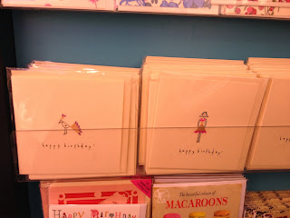
When I was in John Lewis I was given some perfume samples with blotter cards. This one particularly caught my eye and I ended up getting in conversation with the lady on the Chanel stand who was telling me that they often bring out unique designs like this and also use it for their packaging too. So I thought I should maybe look in to gift wrapping as some further research.
This design however is stunning in my opinion. I absolutely love how the recipient is able to push the bird through the paper to give a 3 dimensional effect. It also gave me the idea of using the same concept on my own work but instead of it just popping out for aesthetic purposes, using it to mark the page by pushing it up so it would stick over the top of the page. I will have to illustrate this on my design practice blog to illustrate what I mean.
This design however is stunning in my opinion. I absolutely love how the recipient is able to push the bird through the paper to give a 3 dimensional effect. It also gave me the idea of using the same concept on my own work but instead of it just popping out for aesthetic purposes, using it to mark the page by pushing it up so it would stick over the top of the page. I will have to illustrate this on my design practice blog to illustrate what I mean.
When I came back to Leeds I decided to continually keep an eye out for any eco-friendly design. I visited a couple of shops in Leeds to see what is already out there. Coincidentally the first shop I visited was 'Blott' and their window display is pictured below. I considered it as a sign almost, however it is autumn and a very seasonal display to choose.
Inside Blott I saw this white board. This made me consider having some form of reusable surface included inside my information pack so that the user could write notes as they are reading through all of the information. As it would be aimed at other graphic design students, they may perhaps have a brief they are working on and need help with and so they would be able to note down anything they need to at the end of every chapter essentially.
I could also appreciate this cardboard packaging as it is eco-friendly, using little ink to produce it, and once again I am fond of the way they have designed the smaller boxes with holes to view the product in. This is because I think it gives the audience a bit more of an idea of what they are about to buy, rather than having to open the box in the shop.
I had seen these cards a while ago and thought that the idea behind them is extremely clever. Using pencil shavings the designer has created a range of different cards making up images with the shavings. This is one way of recycling materials which has never been done before I don't think.
I thought this idea worked particularly well when applied to this card below, illustrating bunting. By simply using a variety of different coloured pencils they have created such a dainty and clever card.
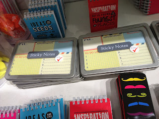
When I came across these sticky notes I thought it may be quite fun to include something along the same lines within my info pack. To provide other graphic designers with sticky notes would enable them to mark pages (another way of doing this) or simply make their own notes which they can understand more easily perhaps.
This is just another example of how the cut out packaging creates the outline of the product, in this case the monster. I think it is a really clever concept and something I will certain be considering.
This is a great way of organising objects found on an office desk. It would also be a clever way of organising information too perhaps. Although I think there are too many processes for this to work successfully for this brief.
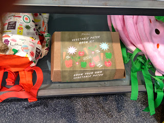
When I first walked in to the shop I came across this box. It is hard to see on this photograph, but the lid was shaped in a particular way so it was easy to lift off once the belly band is removed. I liked this element, as well as the illustrations included on the design too.
This caught my eye due to the illustrations. I think they are really playful and fun, but would perhaps be more suited to a younger audience than graphic designers of my age roughly.
These typography stamps inspired me to perhaps created my own set of stamps to use to create my pack. It also made me think about creating stamps using natural materials such as fruit or vegetables.
Once again these handy notes are uniquely shapes, inspiring me to create my own which are relevant to my brief and the outcome I create.
I then visited Lush to see whether their packaging inspired me at all and out of all of their samples I liked this one the most. The hand rendered text gives it a personal feel and the rope with the label gives it an added authentic touch.
I also found some more sticky notes which I thought were quite creative as they weren't presented as a plain square, but instead the shape and detail had been considered to reach a specific audience. This is most certainly something I could do with mine.
I came across this notebook, which links in with this brief as well as my research I carried out over Summer on plastics. I was happy to see that they had some eco friendly design within the store as it shows that well known brands are trying their best to be as green as possible.
Below is the notebook I ended up buying, with 100% recycled paper inside. This gave me the idea to use recycled paper for my information pack. I did also consider making my own paper from scratch but this would be too time consuming especially for the amount of pages I will have to produce.
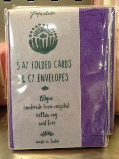
I then saw that they were selling cards and envelopes which were made from cotton and had been recycled also. I think a lot of this paper is quite unique and it offers a unique feature to a piece of design work.











No comments:
Post a Comment