Lorraine informed us that the missing stem on the 'A' symbolises the death of Albert, and so Victoria and Albert were no longer complete as a couple anymore. This led me to carry out some further research.
The V&A Museum

Alan Gerard Fletcher (27 September 1931 – 21 September 2006) was a British graphic designer. In his obituary, he was described by The Daily Telegraph as “the most highly regarded graphic designer of his generation, and probably one of the most prolific”.
Much of his work is still in use: a logo for Reuters made up of 84 dots, which he created in 1965, was retired in 1992, but his 1989 “V&A” logo for Victoria and Albert Museum, and his “IoD” logo for the Institute of Directors remain in use.
The Victoria and Albert Museum had generated many marks of identity and in an effort to rationalise this situation the trustees commissioned a new symbol to replace all the others. The brief stipulated the design should only comprise three characters (V&A), should by functional, dateless, memorable and appropriate. The letters, originally designed by Gianbattista Bodoni in Parma some two hundred years ago, were selected for their elegance and historical importance. By removing a leg of the A and tucking it up to the ampersand, the mark achieves a unique configuration without loss of legibility.

Troika recently unveiled a kinetic sign that directs visitors to London's V&A Museum from the tunnel at South Kensington tube station. Referencing the simple beauty of Alan Fletcher's celebrated identity for the museum, the designers created the stand-alone artwork, Palindrome...
The piece is essentially a revolving V&A monogram suspended in a cylindrical ceiling-mounted capsule. According to Troika "the logo decontructs and reconnects itself with each half turn forming a playful palindrome legible from either side, while the wheels produce a gentle ticking sound reminiscent of a Victorian automaton clockwork."
While the piece looks to be made from three floating sections of lettering, the installation in fact features some 85 handmade elements including fasteners, gears and a housing case, which hark back to the objects (and the ways that they're displayed) in the museum itself.
To view the piece in action, check out the video clip below. For some more imagery and details on the making of Palindrome, see Troika's description at the bottom of the post.
Palindrome is installed in the "museum tunnel" leading from South Kensington tube station to the V&A museum in London.


Troika explain how they made Palindrome:
The technique of mirror-polished high-quality brass and stainless steel was followed with an acid-etching process resulting in a highly contrasted decorative pattern. Using traditional machine processes proved unfeasible for gears of this particular thinness and the complex surface design required a bespoke method of cutting.
This distinct work process required that the gear profiles were developed within the limitations of its process. By adopting high precision water-jet cutting meant that we could allow the stainless steel plates to be acid-etched, then filled with gloss black acrylic varnish before being cut into their final profiles.
Suspended from a lit casing, the bright blue letters are each 0.5 metre high, and balanced by an internal pocketing to ensure a minimal load on the purpose-built mechanism. As a result, the work can be powered by a small motor and generate the revolving motion using only the three small mitre gears seen on the top of the ampersand.
The entire delicate compilation is encased in a clear acrylic tube of 0.7m diameter wide and 1.3m long. The tube is closed off with rings, each 0.74m diameter wide produced from solid aluminium to give it its spectacular finish.
Twinings
Posted on / Category: Design
The other day I was savouring a particularly delicious Earl Grey tea and decided to research the topic. As it often happens on Wikipedia, I stumbled upon another page, the one of Twinings, a Londoner Tea marketer. The article is quite short but it caught my attention immediately. The description reads: “It holds the world’s oldest continually-used company logo, and is London’s most long-standing rate-payer, having occupied the same premises on Strand since 1706.” Being a designer, the topic piqued my curiosity and left me wondering if keeping the same logo for such a long period could add (or not) value to a company.
Design obsolescence and desires
Planned obsolescence or design obsolescence is a widespread practice since the modern era. Whether we are talking about cars, clothes, jewellery, appliances, technology or even art, they all end up going out of fashion in a matter of years, sometimes even months. And we accept that as normal, agreeing to buy new clothes and accessories every year, replacing cars and appliances that might still work only because they don’t fit in anymore.
There was a definite shift in consumption (this includes branding, products and design-related trends) in the first half of the 20th century. Edward Bernays, Freud’s nephew, also considered one of America’s most influential men according to Life Magazine, was one of the main players in this societal change. Quoted from his book entitled Proganda published in 1928 is a passage which describes how the people’s minds and consumption habits can be influenced and controlled: “Human desires are the steam which makes the social machine work. Only by understanding them can the propagandist control that vast, loose-jointed mechanism which is modern society.”
Where am I going with all this? Well, logos as old as Twinings’ are extremely rare in the 21st century because design trends are ever changing; the few big companies that often control the essential of a market (oligopolies) set those trends in order to influence people’s lifestyles and attract younger audiences. An example of switching trends (which I personally find incredibly silly) is Pantone, a company that arbitrarily selects an annual color which influences a whole year’s fashion, from clothes to interior decoration and even graphic design. Smaller businesses are often bullied into following the wave to stay in the loop and survive. Every few years, their branding must be redone (by graphic designers like me) to match the industry’s new look and standards.
That said, is there such thing as an eternal logo? Or is such an idea pure folly?
The case of Twinings… and a few others
Twinings is a very peculiar case; they are located in the same premises as were when they opened over 300 years ago in 1706. It was in 1787 that their logo was designed and they’ve kept it intact since. Was there ever a need for change though? In my opinion, no. Twinings’ logo is a simple, classy and timeless serif font. Although it is not particularly dynamic, it matches its industry, product and communicates its historical background with success.

Was it a strike of luck or masterful execution? After all, it is not uncommon that typefaces go out of fashion. How can a designer foresee 225 years in advance if the typography they use will still look “cool” over two centuries later? Helvetica is in vogue right now but who’s to say it will still be considered beautiful in another fifty years? It could end up like Papyrus and Palatino Lynotype which are considered overused today.

Twinings might have the oldest logo still in use, but it’s not the only company whose brand is still near-identical to its original version. Take BMW’s logo with its quarters painted blue and white, inspired by a plane propeller; it has been virtually the same for almost a hundred years, only lightly tweaked to add embossing. Coca Cola, London’s roundel (Underground) and General Electric also have logos which are similar to their first edition. But for every logo that kept the same look, many more changed their emblem over the years. Burger King, Starbucks, Xerox, Best Buy, Gap and Walmart, to only name a few, all recently had a facelift, and while some of them received quite a lot of praise, others were welcomed with harsh critique and disapproval.
Keeping your logo or changing it – What’s best?
My answer to this question is that it depends. If a logo is badly designed from the start (this could be due to low budget, hiring a bad designer or trying too much to be in fashion, often resulting in an outdated and tacky logo once the trend dies off), redesign is nothing to be ashamed of. It could in fact improve greatly the image of a firm and bring new customers.However if a logo is well done since the beginning there is no reason why it should be changed… unless you are sure you can do much better. If it ain’t broke, don’t fix it – could very well apply here.
Of course, some designers will disagree with me and choose to embrace change, arguing that a logo needs to “freshen up” every decade or so. What those designers fail to see is that such tactics are usually employed to lure new consumers to a company. In a Capitalist world of overconsumption, it makes sense to always titillate the public in order to make more money. I believe though that design shouldn’t always be about making money and that change, if embraced, should be done for higher ideals than only getting more green paper in your wallet. Twinings understood that. They found the right logo for them, an emblem that represents them just right, and they kept it.
This quote is taken from the Twinings website:
In 1706 Twinings started selling fine teas in England.
Today we sell more than 200 teas in more than 100 countries throughout the world.
Join us as we celebrate over 300 years of passion and commitment to assuring you the world's finest tea experience.
I think it is quite an achievement for a brand to be this successful. Now that it is distributing tea worldwide it is likely to continue to be just as successful, and with a strong logo in place, there is no need for them to change it in my opinion.
Starbucks
I decided to carry out a search to find the logos which are considered as being the most successful in the world. Starbucks was one of them, and so I decided to research in to the design.
I found it really interesting that so many modifications were made until it was just right. It just goes to show that designers aren't afraid of admitting to their mistakes in the public eye, by releasing the variations along the way as opposed to getting it right the first time.
Starbucks Logo | ||
Starbucks is a company, which is well known throughout the globe. Known mostly for their coffee, the Starbucks brand The Starbucks logo shows a green band with two stars and a crowned Siren in the center of the logo. It is haunting yet attractive and recognized throughout the world, and provides an excellent lesson in logo design.
Brief History of Starbucks Logo
Designed by Terry Heckler of Heckler Associates, the iconic mermaid that beckons coffee drinkers was based of a classic 15th century Norse woodcut of the mythical siren. The hardy yet feminine look was perfect for the Pacific Northwest local. Evoking the local lumber industry’s history in the area coupled with an inviting face, the logo was a perfect fit.
However, the finely crafted corporate identity soon faced challenges. How do you place a bare breasted siren on the side of a truck? Modify! Eventually, the siren’s hair was lowered to cover the bare-chested icon. Then the suggestive pose of the mermaid, posed a unique branding challenge during Starbucks rapid expansion. What had seemed a clever and folksy design in Seattle was considered risqué in other parts of the country? Modify Again! Soon, the offending pose was slightly altered, and then eventually the pose completely obscured.
Evolution of new redesigned Starbucks logo
The current Starbucks logo that the world knows today now focuses on the warm and inviting face of the mermaid, rather than her body. The iconic cigar band outline remains, framing one of the most famous corporate identities in the world. The story of the Heckler Associates modification and re imagination of each subsequent logo design is necessary for anyone interested in logos and branding.
|


Source

I then wanted to find out more about IBM, and whilst doing this I came across a website which illustrated how many logos have improved over time.
The evolution of logo designing could be traced back to the Ancient Greece, when the rulers and their dynasties used to use cipher as a monogram in their coins. However, the modern logo designing dates back to the early days of the Renaissance, around the 13th Century. Goldsmiths, masons, paper makers, and potters, were among the first trades people to use marks-pressings into gold, chiseled symbols, watermarks on paper, and simple thumb-prints on pottery.
Today there are many corporations, products, brands, services, agencies and other entities using an ideogram (sign, icon) or an emblem (symbol) or a combination of sign and emblem as a logo. However, only a few of the thousands of ideograms people see are recognized without a name.
Let’s look at the history and evolution of the well known logo designs. If you are a logo designer, I bet you will learn a lot from their mistakes, and a long path of improvements until they’ve reached the final design. If you are just an ordinary mortal – don’t worry, this will be at least very entertaining for you.
P.S.: I’ll try to keep this logo evolution post up-to-date as much as possible. So, if you see anything missing here on Bored Panda’s logo evolutions list, please let me know!
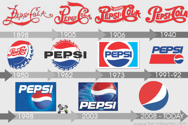
Pepsi Logo Evolution
Manufactured and marketed by PepsiCo, it was first developed and produced in the early 1890’s by Caleb Bradham, a pharmacist in New Bern, North Carolina labeled as “Brad’s drink”. In 1898, Bradham renamed his drink into “Pepsi-Cola”.
In 1898, Bradham used a scribbled logo script as the first Pepsi logo to brand the product. When his business got established and people started enjoying his drink, Bradham decided to modify the Pepsi logo into a more customized version of the previous logo script. Thus, in 1905, a modified script logo was introduced, followed by a second change in Pepsi logo in 1906 with the inclusion of the slogan, “The Original Pure Food Drink”, in it.
By 1943, the Pepsi logo adopted a “bottle cap” look that included the slogan, “Bigger Drink, Better Taste”. Later, in 1962, the Pepsi logo was replaced with two bulls-eye marks encircling “Pepsi”, and then again in 1973, into a boxed Pepsi logo with minor typeface changes.
In 1991, Pepsi commemorated the evolution of its scripted Pepsi logo by featuring a logo design with an italic capital typeface. Later at the company’s 100 years celebration in 1998, Pepsi-Cola unveiled a new logo that symbolized the brand’s innovation and global recognition. (Read more: here and this pdf)
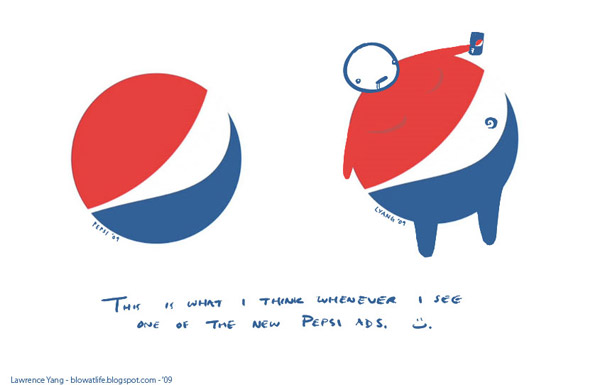
RESPONSE TO THE NEW PEPSI LOGO
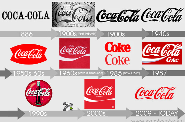
Coca-Cola Logo Evolution
Coca-Cola was first served in 1886 and even then, the first official logo of Coca-Cola was not the script logo. It first appeared in the Atlanta Journal Constitution in 1886 as both a slab serif and chunky sans serif – it wasn’t until mid-1887 that Frank Robinson, Coca-Cola’s bookkeeper, drew the first traces of the Spencerian script logo that we all know.
For the first ten to twenty years you could probably find a dozen different executions of the Coca-Cola script as the logo was probably drawn over and over for different applications. It isn’t until the 1930s and 1940s that a clear interpretation of the logo appears and is used consistently. During the late 1950s and early 1960s the script logo is placed within a shape, referred to as the “fishtail” logo, which is as off-brand as anything that Coca-Cola has ever done.
In 1960′s the wave was introduced, a ubiquitous visual today, when Lippincott Mercer was in charge of making the Coca-Cola identity more consistent.
“New Coke” introduced in 1985 had a new formula marketing and its own set of logos – that completely ignored the script logo – that left a bad taste in their consumers’ mouths. Around the same time, in 1986, Landor began rolling out an even more developed brand identity that modified the wave among other subtle changes.
Today’s Coca-Cola logo is amazingly similar to what it was 124 years ago. (Read more: here)
Apple Logo Evolution
The original logo was designed by Ron Wayne, who started Apple with Jobs and Woz in 1976. In 1977 White sold his portion of Apple back to Jobs and Woz when they incorporated. The image is a pen and ink illustration of Sir Issac Newton leaning against an apple tree with a portion of a William Wordsworth poem running around the border: “Newton…A mind forever voyaging through strange seas of thought…alone” (Prelude, Book III, Residence at Cambridge)
Steve Jobs decided to scrap this image because he felt that Wayne’s logo was too cerebral and not easily reproduced at small sizes. In 1977, with Wayne gone from the company, Jobs turned to the Regis McKenna Advertising Agency to produce a new, more iconic logo. After several attempts and variations (and a ton of money spent), the result was the most iconic of all Apple logos. The Rainbow Apple logo.
When Jobs returned to Apple in 1997, the company was bleeding money, and Jobs and Co. realized that the Apple logo could be leveraged to their advantage. Placing a large rainbow Apple logo on top of the original Bondi Blue iMac, for example, would have looked silly, childish, and out of place. Not exactly the direction Jobs wanted to lead Apple in. So instead of placing a somewhat minuscule rainbow colored Apple logo on its products, Apple began placing sizeable and Monochrome styled logos on its products. (Read more: here and here)
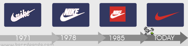
Nike Logo Evolution
The Swoosh logo was designed by Carolyn Davidson in 1971 – “ a graphic design student that Phill Knight met while teaching an accounting class at Portland State University to supplement his then-fledgling business. He paid a grand total of $35! Phill never liked the logo but stuck onto it quoting “I don’t love it, but it’ll grow on me”. 12 years later in 1983, Davidson got an invitation to lunch by Nike where Knight surprised her with a gold Swoosh ring embedded with diamond and an envelope containing Nike stock.
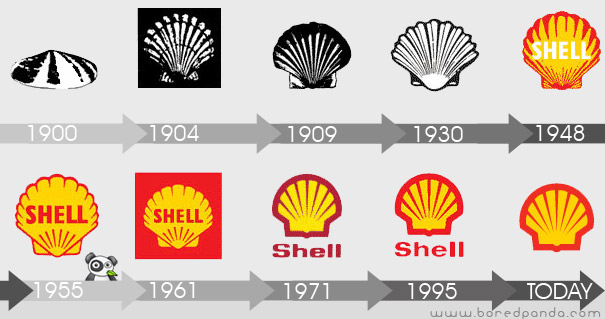
Shell Logo Evolution
Since first appearing in the early 1900s, the Shell logo has moved from a realistic rendering of a pecten, or scallop shell, to today’s bold shape with distinctive colors.
Both the word “Shell” and the Pecten symbol may have been suggested to Marcus Samuel and Company (original founders) by another interested party. A certain Mr Graham (of apparent Scottish origins) imported Samuel’s kerosene into India and sold it as “Graham’s Oil”. He became a director of The “Shell” Transport and Trading Company, and there is some evidence that the Shell emblem was taken from his family coat of arms.
It was around 1915 when the rendering allowed for easier reproduction, shown in the 1930s symbol above.
Colour first appeared with the construction of Shell’s first service stations in California. Not only did Red and yellow help Shell stand out, but they’re also the colors of Spain, where many early Californian settlers were born. Perhaps by displaying Spanish colors it was hoped an emotional bond would be created.
From the 1950s onwards, the icon became more and more simplified, improving recognition and memorability. The 1971 logo, which is still used today, was designed by the French-born Raymond Loewy, who also created logos for BP and Exxon. (Read more: here)
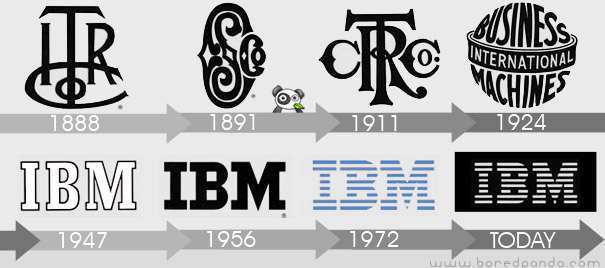
IBM Logo Evolution
The company which became IBM was founded in 1896 as the Tabulating Machine Company by Herman Hollerith, in Broome County, New York (Endicott, New York, where it still maintains very limited operations). It was incorporated as Computing Tabulating Recording Corporation (CTR) on June 16, 1911, and was listed on the New York Stock Exchange in 1916.
IBM adopted its current name in 1924, when it became an international manufacturing company. The logo that was used from 1924 to 1946. The logo is in a form intended to suggest a globe, girdled by the word “International”.
The logo that was used from 1947 to 1956. The familiar “globe” was replaced with the simple letters “IBM” in a typeface called “Beton Bold.”
The logo that was used from 1956 to 1972. The letters “IBM” took on a more solid, grounded and balanced appearance.
In 1972, the horizontal stripes now replaced the solid letters to suggest “speed and dynamism.” This logo (in two versions, 8-bar and 13-bar), as well as the previous one, was designed by graphic designer Paul Rand. (Read more: here)
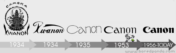
Canon Logo Evolution
The origin of today’s world famous brand Canon can be traced in Precision Optical Instruments Laboratory that was established back in 1933. The first set of cameras was manufactured as a part of business trial and these early birds were named Kwanon after the Buddhist Goddess of Mercy. Now this Goddess was the possessor of thousand arms and spat flames.
From the very beginning, the company worked with an ambition of reaching out to the outer world and as such the company wanted to adopt a name that will be acceptable globally. With this intention, the company name was changed from Kwanon to Canon and it was registered as the logo trademark name of the company in the year 1935. (Read more: here)
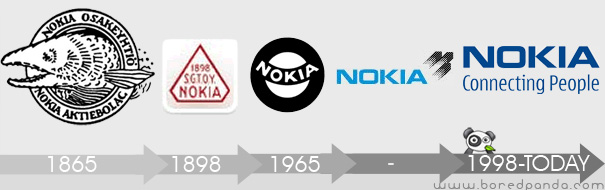
Nokia Logo Evolution
In 1865, Engineer Fredrik Idestam established a wood pulp mill on the banks of the TammerKoski rapids in the town of Tampere, in southern Finland. Later in 1868, he built second mill by the Nokianvirta River, which gave the Nokia its name. In 1871, Idestam and his friend Leo Mechelin, renamed and transformed the firm into a share company, thereby founding the Nokia Company.
The first logo of Nokia was created in 1966 showing the image of a fish. This image should be inspired by the salmon fish of Nokianvirta River.
In 1898, Eduard Polon founded the Finnish Rubber Works, which later became Nokia’s rubber business. The new company tried producing many products like papers, bicycle, car tires, footwear, communication cables, electricity generation machineries, televisions, aluminum, capacitors, and lot more.
In 1967, three companies, which were jointly owned since 1922 by Nokia, officially merged and created Nokia Corporation. After the merger, Nokia Corporation adopted the logo which was all black rounded shape emblem, in which “Nokia” was written in white.
At the start of its telecommunication equipment manufacturing, Nokia adopted the logo which was quite similar to the current one, but with the light blue color and the arrow like shape pointing upward. Arrow in the logo represents the Nokia’s progress and advancement in telecommunication industry. (Read more: here)
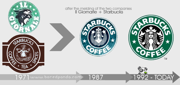
Starbucks Logo Evolution
Il Giornarle was the espresso cafe Howard Schultz opened up in 1986 after failing to convince the original owners of Starbucks to focus on serving espresso beverages. By 1987, the two remaining original owners of Starbucks decided to sell the business and Howard jumped at the chance to buy Starbucks and remake it into the espresso bar concept he had just begun at Il Giornale.
“To symbolize the melding of the two companies [Il Giornarle and Starbucks] and two cultures, Terry [Heckler] came up with a design that merged the two logos. We kept the Starbucks siren with her starred crown, but made her more contemporary. We dropped the tradition-bound brown, and changed the logo’s color to Il Giornarle’s more affirming green.” (Read more:here)
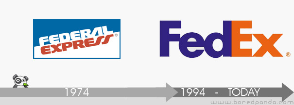
FedEx Logo Evolution
An interesting case is the refinement of the FedEx logo, where the brand consultants convinced the company to shorten their corporate name and logo from “Federal Express” to the popular abbreviation “Fed Ex”. Besides creating a shorter brand name, they reduced the amount of color used on vehicles (planes, trucks) and saved hundreds of thousands of dollars in paint costs. Also, the right-pointing arrow in the new logo is a subliminal hint of motion.
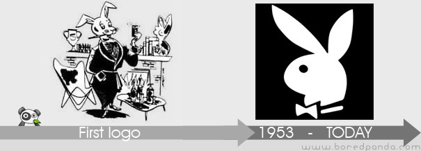
Playboy Logo Evolution
Art Paul was working as a freelance designer when he in 1953 was contacted by playboy founder Hugh Hefner who needed a logo for his new magazine. He created the now famous rabbit wearing a tuxedo bow tie. Paul went on to design the whole first edition of the magazine and was hired by Hefner as Playboy’s first art director in 1954, a position he held for 30 years.
Playboy magazine claims it once received a letter at its Chicago, Illinois offices with its distinctive “bunny” logo as the only identifying mark, appearing where the mailing address normally appears.
No comments:
Post a Comment