Thursday 31 October 2013

OUGD503 Responsive - Design Process 2: Studio Session 1

At the start of today's session we discussed the briefs we had printed off in preparation. We had been asked to find a selection of briefs online which we would find interesting to fulfill. Fred asked whether anyone had found any particular websites other than the ones provided that we may have found interesting briefs on. Lizzy mentioned that she had found RSA Design Awards and the briefs on there were very applicable. However interestingly we were veered away from this as a class, because we were told that they can become too large to complete, whereas we may benefit more from ones with tighter deadlines and a higher turnover. I thought this was something worth noting down so that I don't end up committing to completing a brief which is too time consuming, limiting myself from completing others.

We were then given a general overview of the year ahead and what is expected from us:

Studio Brief 1 - Individual
Studio Brief 2 - Collaborative
Studio Brief 3 - Reports

We were however told that although the first semester we will be concentrating on individual briefs, there is nothing to say that we can't collaborate. It is still an option we can consider.

This then encouraged me to start thinking of possibilities where collaborative briefs are concerned. As I am currently working on several live briefs which can be included in this module. In terms of live briefs, I personally feel as though I will gain more from them in comparison to competition briefs. Although I am sure I will discover that there are pros and cons to both. I started to list any possible contacts I currently have that I could contact regarding this module and came up with the following:

  • Bar and Bistro - Opened by a family friend
  • Cedar Farm Gallery connection - The possibility of designing there
  • Summer work placement  - The possibility of inquiring about a live brief
  • A friend studying Graphic Design at another University - Meet up with him and collaborate perhaps or see if he knows anyone who may interest me
  • Contact Sony - Through a relation who works there
  • Contact the BBC - Through a friend who works there
  • Third year - Have a discussion and get any advice
  • Current design work - Any clients I am currently working for may need additional work in the future
  • Third year Fashion student contact - Collaborate and brand her clothing or herself
  • Second year Fashion student contact - Collaborate
All of the above are my initial responses and thoughts concerning this module, I am going to try and investigate in to each of them to see whether I could potentially get some more live briefs.

We were then told that we have to complete a minimum of 5 briefs as well as other live briefs each and that we must take in to consideration the deadline, ensuring that they are all realistic.

The first brief we choose needs to be long enough for us to have time to evaluate as a class, as opposed to completing a brief by the end of next week, as this wouldn't work with our timetable.

We were then asked to do the following...

Identify things I want to get out of this module?
  • Knowing how much to charge for live briefs
  • How many changes to allow for live briefs
  • Successful websites to use in the future
  • Develop all skills (editorial, branding, etc)
  • Build even more contacts
  • Improve being able to improvise
  • Perhaps contact studios abroad/in Vancouver/Fabien Barral (inspirational designer) and see if there would be any opportunity in the future to work with them
Class discussion of our thoughts
  • Time management/discipline
  • Deliver what I promise
  • Understanding time scale
  • Award/prize/fame
  • Exploitation - Payment
  • Range of briefs
  • Understand brief - brief analysis
  • Exposure
  • Portfolio development
  • Portfolio with a range of briefs - coherent
I suggested
  • Effective professional communication
  • Creative compromise
  • Building contacts and opportunities
Why do you think live/competition briefs are going to be useful?
  • We will learn how to interact professionally
  • Public eye - exposure
  • Work with a variety of deadlines - could vary a lot
  • We will learn a lot about ourselves - some of us may discover that we don't like working for a variety of clients and looking for them ourselves, but instead prefer studio work
  • We will discover new strengths/weaknesses
  • Meet new people
  • Help us to understand who we are as designers/specialism
At this stage we were then told that ISTD gives brutal feedback, so if we do ever decide to submit work for a live brief, we may receive feedback we hadn't expected.

Class discussion of our thoughts
  • Improving professional design skills
  • Challenge of professional brief
  • Push past university - shows commitment beyond university work
  • Clearer/effective working practices
  • Real work bench marking
  • Professional responsibilities
  • Gain confidence
  • Contacts
  • Professional feedback
I suggested
  • Professional experience - freelance/studio
We were then asked to look at the briefs we had brought to the session and write down why we had chosen each of the briefs. I came up with the following reasons:

The Body Shop
  • Ethical morals tie in with my current practice
  • Packaging is something I am passionate about 
  • I love their branding
  • Greener packaging
Greenpeace
  • Serves an important purpose
  • Links to graphic design in a more functional sense
CA Cosmetics
  • Made me think of the designs of cosmetic labels on products we have at home (one in particular) which I would find inspirational when fulfilling this brief
  • Label design is something new to me
Deriviations
  • Organic skin care - green technology
  • Eco-friendly
Fortnum & Mason
  • Already researched thoroughly over Summer
  • Packaging brief with a specific need and purpose - helping and making a change for people on expeditions
Class discussion of our thoughts
  • Straight forward
  • Short
  • Outside of comfort zone
  • Free to enter
  • Familiarity
  • Prize
  • The best that were available
  • Creative scope/freedom
  • Range of problems
I suggesed
  • Ethical morals
After we had discussed all of our thoughts Fred made a very important point and said that it is all about what you can get out of a brief in terms of why you should choose a certain brief to do. Whether it be social, cultural, political or ethical, it is always worth researching and analysing the brief before actually fulfilling it.

After the break we were then put in to groups of 5 or 6 and asked to look at YCN briefs. Our group was given a brief on Churchill. I took photographs of it:


We were then asked to answer a set of eight questions and just had a couple of minutes to answer each as a group:

Before answering the questions however, we were asked by Fred whether each of our briefs were good and whether they had lots of information and specific requirements. Having just read the briefs we all came to the conclusion that even if they are informative and specific it doesn't necessarily mean they are good. However later on in the session we discovered that in fact, these competition briefs are actually not that specific once pulled apart and analysed.

1. What is the problem?

- Younger generation not aware of Churchill.

2. What is the brief asking you to do about it?

- Inform and educate 11-18 year olds.

3. What is the brief trying to achieve?

- Awareness and recognition of Winston's face.

4. Who will benefit?

- Parents, schools, Churchill branding.

5. What is the message?

- Winston Churchill is the greatest Brit of all times and children should be aware of who he is.

6. Who is the audience?

- Children, parents.

7. How will the message be delivered?

- Appropriate mediums.

8. Can you foresee any problems with the brief?

- Unsure about the tone of voice.
- Anonymity of Churchill.

We then discovered the bigger problems of all five briefs as a class:
  • Companies going bust
  • Help us please
  • Want to make more money
  • Companies will benefit
  • It costs them nothing
  • Harvest ideas - feed us dinner - then they use our work
Entering an agreement which you get no credit for - READ SMALL PRINT.

Try and prevent getting ripped off and ask yourself - WHAT ARE YOU GAINING?

The benefits way outweigh the terms and conditions (you may make contacts).

We then asked ourselves a similar question to earlier, regarding whether the brief is specific and decided:
  • Unclear
  • Not very helpful
  • Not specific
This session made it clear to me that brief themselves haven't been throughout as well as they could be. For example - Churchill are trying to sell home insurance to 11-18 year olds.


Wednesday 30 October 2013

OUGD504 - Design Production: Design For Print (Experimentation)

Whilst I was at home over the weekend I managed to collect a lot of primary research (photography based), a lot of which helped me to make some informed decisions about this brief. Leaves link directly to nature, which in turn links to the environment, which then relates to an eco-friendly environment and potential idea relating to design.

I therefore thought a lot about the primary images I had collected and had a discussion with my mum about all of my ideas. Speaking out loud really helped me to organise my thoughts and getting feedback at the same time was extremely useful, quite like having a relaxed crit.

After much discussion I considered how I could incorporate nature/an eco-friendly element in to my work, and I instantly thought of leaves. My thought process then got progressively deeper and deeper and I started to think about making my own ink out of leaves. I did some research online to find out how I would do this and posted it on my blog for future reference. It had started raining heavily so I waited until another day to carry out this experiment.

The main reason I thought of using leaves however, is because as I was discussing my ideas, I came up with the idea of 'take a leaf out of my book' and perhaps using this on the front of my print pack in some way, essentially providing the reader with a guide to print, whilst giving them advice throughout the pack of how to be eco-friendly whilst designing. As I feel it is important to be aware of how to produce sustainable design to be a successful designer in the present day. If we don't start making the changes now, then the situation is simply going to deteriorate and more and more natural habitats are going to be ruined because of all of the harmful methods we currently use to produce our work.

This is why using recycled papers, fruit or nature, and hand crafted work is a clever way of portraying how everything is possible when stripped down to the bare basics and knowing how to create something without constantly relying on endless amounts of technology.

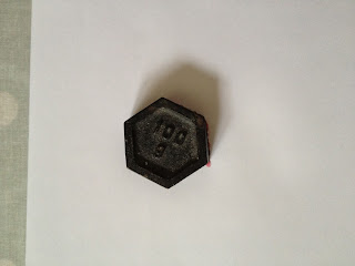
Whilst researching however, I found out that ink can also be created quite effectively using fruit and vegetables. Impatiently, I decided to carry out a very 'home made' experiment to get the ball rolling with the design process. Below is a photograph of all of the equipment I used. As I didn't have a specific stamp I used a weight. This weight was not only used to print but I also crushed the raspberries initially with a spoon followed by the weight. As I was at home, I didn't have a large variety of stock to experiment with, so I started with A4 plain white paper.


Using the weight, I placed it on top of the raspberries to start with and then transferred the print to paper. It worked surprisingly well, however it did show up all of the textures and seeds within the raspberries which had obviously not been crushed or removed before printing. This gave it an added organic feel however, which I personally quite liked.


I then attempted to make a pattern using the same method, however the weight didn't work well every time to produce a successful print. I think the second example below the top print was a lot more successful without all of the seeds in the way.


I then printed on to a brown envelope. This wasn't very successful though although it looks quite effective on this photograph. As it dried it faded in to the paper and didn't stand out very much. Overall, I was happy I had experimented with food just as an initial start, but I wouldn't use this method for my final piece of work I don't think, especially as raspberries don't really have a relevant link to my design for print pack.


Using the research found on my design context blog I followed instructions from an online website. The website explained how to use natural materials to produce ink. To start with, I chose to use leaves for this experiment and I collected them on my way home from uni one day.


I then prepared the leaves and finely chopped them as the instructions said.


Once I had finely chopped them up, I was able to place them in a pan and cover them in just enough water, then placed them on the hob ready to boil. Although the instructions said to do this and then allow it to simmer for 15 minutes, I found that the water was absorbed quite a lot by the leaves themselves, perhaps because I had it on a high heat which was then hard to reduce as it takes a while for our hob to cool down.


Once I placed them in the pan with the water this is what the mixture looked like. 


Once the water had been absorbed it looked like this. However I still used it to create ink and poured out any excess water in to a glass to see how much I had made.


It turned out that it had produced very little ink. 


I didn't want to just give up at this point though, especially as experimentation is all about trying to find the best solution. This is why I continued to add water to the pan and then boil it again until more ink was produced. I could have easily continued to do this and remove as much of the ink from the leaves as possible. However, now that I am aware that this process works, I will be able to carry it out again in the future and if necessary, simply continue to add water until no more is produced.


Once I had produced the ink, photographed above, I was then ready to transfer it to paper. I tore off the cover piece of paper from my new notebook, as well as an A4 piece of paper. 


Using a knife I dipped it in to the glass and simply placed lines of different widths on the piece of paper. I did this to see whether it would effect the end result.


Once I had printed on to A4 paper I then decided to use the brown. I quite like the result on this stock, however it does make the green appear to be a much more subtle shade against a dark background. Essentially, I was able to experiment a bit with stock within this experimental process, however I should have really used hand made paper which may have allowed the ink to soak in a bit more successfully and appear to be a darker shade of green.


I then used a scrap piece of cream stock and put two circles of varying sizes on it then waited for them to dry. Overall, I think this was the most successful stock to use in this case. However I am not sure whether this would alter depending on the quality of paper I use. The next time I experiment with this I would like to use a wider variety of stock as well as figure out how to alter the substance slightly, as I feel as though it needs to be thicker and more applicable. For example, if I was to design a pattern and use the laser cutter to cut it out as a stamp, I would then need to dip it in to the ink solution, at this point in time with the ink being so watery and thin, this wouldn't work. Whereas if I was to add some glue perhaps or another thickening substance then it may be more likely to work and produce a successful result.

If this doesn't work however, I am going to have to re think my idea and perhaps use this liquid solution to alter the colour of hand made paper, and then use embossing to produce the desired effect (whether it is an image or typography I am wanting to produce). 

If this proves to be too much of a task to work with all the way throughout the pack, then at least I can use it for elements of it, allowing me to then talk about it at the end of the information pack and explain how eco-friendly processes have been used to produce this 'manual'. I could also consider perhaps using paper cut/laser cut techniques instead.

I think most importantly, it is crucial that I make it as eco-friendly as possible in terms of the materials used. Whilst at the same time portray the processes I enjoy through using them to create the information pack itself. I wouldn't want to use all of the processes because I just don't think this would look right. I would prefer to use hand rendered illustrations to explain all of the different print processes instead.


OUGD504 - Design Production: Design For Web (Body Shop Primary Research)

When I was walking through Leeds today this window display caught my eye. When we had our first session with Lorraine and Phil I started to draw out an idea relating to what my website could potentially look like. The Body Shop consider the environment profoundly when they release new products. They ensure that they work as ethically as possible to produce their packaging from the first stage to the production of the product itself.

This was the first window which caught my attention. It relates closely to the design I came up with in the first session as I illustrated how my homepage could have a world in the centre separated in two to illustrate the effects of plastic as well as sugar cane on the planet. This image below would influence me to perhaps create a world using sugar and dying it various colours - It could be black on one side to illustrate the negative effects of plastic and then the other side could be vibrant and green relating to sugar cane.


If I decide to look at case studies around the world I could take inspiration from this window display. I could use sugar perhaps again to form the structure of the earth and pin point relevant areas with an illustration or info graphic for sugar cane.


The image below demonstrates The Body Shop's ethical views. I could include something along the same lines as this on my website to make people aware of why sugar cane is becoming more popular to create products such as plastic as well as a variety of different objects such as clothing. I think I have so many options at the moment to choose from in terms of content but I need to really narrow it down so I can start designing.


Tuesday 29 October 2013

OUGD504 - Design Production: Design For Web Studio Session 2 (Task 2)

Today we had our second studio session with Phil and Lorraine. We weren't however with the same DP group we had previously been with though, instead we were just quite a small group. This was because the other groups were in their second web session. I know that some people struggled with having this session in the morning as they hadn't yet had their first one, which meant that they didn't understand a lot of the terminology being used in the session.

I found this session quite helpful, however I feel as though we could have either achieved more in the time we had, or should have had less time to complete the given work.

At the start of the session we had a briefing where we were told what we would be doing for the rest of the afternoon. We then went in to the studio and started the session.

We started with Part 2:
 
Using our selected print outs of website design, we were asked to draw out underlying grid structures. We were given about 45 minutes to do this which seemed like quite a long time. I found it useful and it refreshed my memory concerning grids though. As I had some spare time after completing this task, I decided to start analysing the websites and making annotations on each one. This was helpful to me as I was able to observe any features that I liked and could potentially use on my own website.


Part 1:
 
We then had to produce a flow diagram to illustrate how our website would work when considering the links we would use for each of the pages. This was only a short exercise but it is something I need to strongly consider. I will be able to review my options when I complete the task for Simon next week which involves looking at scamps and designing my own relating to my own brief.

 
Having completed this exercise we were then asked to, as a group on each table, think about commonalities of navigation:
  • scroll bar
  • hyper links
  • map
  • links at the top
  • read more button
  • side bar
  • drop down menus
  • highlighted text
  • next page
  • previous page
  • back to the top
  • page numbers
  • video previews (play button)
  • thumbnails of images
  • breadcrumbs
Then we had to think about uncommon examples of navigation:
  • pop up ads
  • no links
  • menu at the bottom
  • everything on one page
  • not starting on home
  • landing page
We then discussed our findings are a class to see whether we had thought of the same things. This was the concluding exercise to this session.


Monday 28 October 2013

OUGD504 - Design Production: Design For Print (Embossing Experimentation)

As out print information pack will be based on all of the different print processes Ellen and I took it upon ourselves to book a second session with Matt who carried out our laser induction last week. We wanted some guidance where embossing is concerned, as we were unable to book in at Vernon Street. We booked an hour slot and had a machine each with one to one help. I really enjoyed this morning's session and learnt a lot. I most certainly became more confident with using the equipment as well.

Initially, I was going to prepare some text to laser cut, however I thought it would be more beneficial to wait until this morning and get some advice on the best way to save the work to make it easier for the laser cutter to understand.

I chose two different sans serif fonts and was told to do them white on a black background. This is so that the black will cut out and leave the letters sticking out far enough to use later to emboss.

The reason behind me using the text 'turn over a new leaf', is because initially when I carried out my experiments for this brief using fruit and leaves, the idea of leaves came from the quote 'take a leaf out of my book' which came to me when I was discussing ideas with my mum. I altered this phrase slightly today when I was using the laser cutter because I felt as though 'turn over a new leaf' was perhaps more fitting and more condensed. This is something I need to consider but it will become clear to me when I start designing properly.


Ellen on the other hand did hers the other way, however it is important to make sure that when doing black on a white background to alter the settings slightly so that the laser knows to cut it out using the 'negative' setting.


Having already been told how to set up the laser cutter before now I seemed to remember all of the different stages. First of all we set up the document on the computer, and then we turned the machine on to prepare it so that it was ready to cut. Matt supplied us with small pieces of wood to work with and produce some samples.


Although it isn't very clear from this image, this is what it looked like whilst the laser beam was burning through the wood using the raster setting. I found it fascinating to watch. I had changed the settings on the computer to 0.1 which meant that the outcome would be more accurate and precise, and less spaced out in comparison to leaving it on the default setting of 0.2.


Once I had used sand paper to remove all of the excess dust from the wood, this is what my block of wood looked like, ready to use to emboss. I decided to use the text 'turn over a new leaf' as I think this is potentially what my information pack is going to be called. Or 'take a leaf out of my book'. I haven't yet decided. I was happy however with the outcome of both of the examples below and would most certainly love to experiment further in the future.


It was then time to emboss using our blocks of wood. We went to use the facilities in the screen print area, where they had the correct equipment which was necessary to emboss. Having never done this before it was hard to know if we were doing it correctly so it was simply a case of trial and error.


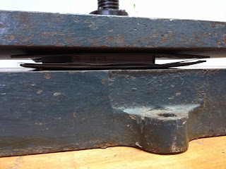
This is what it looked like once our blocks were under the press, along with two protective pieces of card at the top and bottom to stop the paper from ripping or becoming damaged at all in the process. We used newsprint for our first experiment, however it didn't turn out very well.


Below are what all of our wood block tests looked like. It is quite obvious to the eye that the top one was produced at a faster pace, using the 0.2 setting on the computer. This meant that the wood wasn't cut away as deeply. However it was still very effective.


We clamped the paper down and waited for our result. We were quite unsure whether or not it would work at all in fact as the pressure from this machine was perhaps not as strong as it could have been.


This is the outcome front and back of our work. The edges of mine seemed to work better than the area in the centre, however it could have been much more successful.


Luckily I was able to ask for some guidance from one of the tutors. They advised that we bought a piece of handmade paper instead, so we did. We cut it down to a more applicable size. Then I dampened the paper and we first of all placed a sheet of tissue paper down and then the paper on top. This allowed any of the dirt carried on the block to rub off on the tissue rather than affect our design.


We then used the press again to see whether we could produce a more successful outcome.


By make the paper wet it worked much better. However it still wasn't as crisp as we had hoped for. We were told however that the print press found at Vernon Street is more suitable for this as it is a lot heavier and therefore increases the indent. We therefore decided that we would carry out further experiments with this next week, as I feel as though this is something I would like to work with for this brief.