Thursday 2 May 2013

OUGD406 - Speaking From Experience: Final Products

Below are the images of my final designs, printed and ready to be distributed to the students. I am really pleased with the outcome of them all. I feel as though it has taken me a lot of time in terms of trial and error when printing and checking things are aligned, but I have finally reached the point that I wanted to reach. 

I created two of everything to show how easy it is to reproduce which is something that is important in the industry. If I had had all of the most efficient equipment to help me reproduce as a faster pace by using machinery then I could have produced many more. However, for all of the separate products, I used a scalpel and ruler to cut through the paper as well as the plastic once I had laminated it all, it was time consuming therefore trying to ensure that all of the laminated pages were precise and met along the top, to make it easier for the man who bound it for me in the shop. 


I cut the stickers down from an A3 sheet and decided to have two columns with 12 stickers on each sheet overall. I have provided each student with four pages of stickers so that they can mark their food in the fridge or freezer with the name of the item and the date to ensure that everything stays fresh.


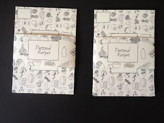
The personal recipe cards have space for parents to write their recipes down for their children at university, or alternatively the stamp area may not be used, and instead the student may decide to call their parents up and write down the recipes themselves.


It is always important to stay organised and make sure that everything is bought at once, rather than arriving home and remembering at the last minute that you have forgotten ingredients. This is why I have created shopping cards for the students, of which I have provided enough to keep them going for a long time. 


When I was at home I came across these tea towels and I think they are ideal for this brief. Everyone always needs tea towels whilst living at home or in halls, so this is a useful gift from me to the students, to ensure that they keep on top of their washing up as well. I hope that the recipes provided give them a good starting point and makes them interested in trying new recipes out rather than buying ready meals or beans on toast, the stereotypical student meals.


Finally, this is what my bags look like. They are big enough for all of the items to fit inside, and they both have an informative label on to explain what is inside the bag. I hope the students really enjoy using what is inside and can hopefully feel inspired about graphic design at the same time.


OUGD406 - Speaking From Experience: Binding Recipe Books

Today I went to bind my recipe books near to college. I found them really helpful. I had left just enough room for them to be able to pierce the holes all the way along the edge. This was the final stage of my work which now means that it is all ready to be put together and placed inside the bags.


OUGD406 - InDesign Rhino Brief: Development

Below are the photographs I have used for my final double page spread. I decided to choose some quite emotive photographs, as the text I have chosen to include is all about how they are endangered and how South Lakes Zoo supports them to try and save them as a species.


I decided to digitally draw some thumbnails before designing my final double page spread. I found this helpful as I could visualise in my head where the images would be situated and whether it would look balanced or not, as I had already decided which images I am going to include.


Here I have enlarged the thumbnail which I preferred the most, although I am going to use this as a basis only and then probably develop and adapt it slightly. Maybe instead of having images above and below the text, to have it more in the centre as they wouldn't be large enough in the space I have currently provided.


Below is the progress of my design. First of all I created guides to help me as I feel as though this is important, especially when using InDesign, as it makes designing so much more accurate and balanced. I then chose to use a font off Da Font which I feel is appropriate, called Isabelle Laine. Although it is quite playful in some respects it also works well with the images I feel, as they are quite cute and emotive. I didn't want the tone of voice overall to be too serious as it would put someone off reading it, so I have tried to make it as inviting as possible in terms of text and imagery.

Here I have tried it with the header in a large size so that it stands out straight away, then I decided to balance the page by drawing a rectangle along the bottom, however I feel as though too much attention is drawn to that rather than what the text says.


I much prefer this already, as I feel as though the negative space around the edge draws attention to the article and the imagery, without there being too much to distract the reader and detract attention away from the important messages within my text.

 
I like this design even more so, as the dotted line seems to break the page up a bit more, making it appear even more balanced. I still feel as though it may be missing something, possibly a border of some sort.

 
I decided to try enlarging everything to see whether it would make much of a difference to the overall quality of my design, I also used a lighter shade for the rectangle along the bottom but it looks too dull and heavy.
 
 
Below I have shown how I got to the final design. I decided to inject a colour into my design and use antique paper to print on eventually. I feel as though this is the best choice possible, as it will make the white space feel less harsh around the edge and will work well with the shade of green I have chosen.


Although the quality of this photograph isn't the best, I just wanted to illustrate how effective it was using antique stock to print on. The quality could have been much better, however considering I printed it out in the studio I am happy with the outcome and like the effect the grain of the paper has had on the print quality.


OUGD406 - Speaking From Experience: Pantone Enquiry

As I am creating a set of stickers to include within my bag I wanted to ensure that they would match up with the antique paper I am using for the rest of my designs. I therefore went and borrowed a pantone swatch to match the colours as closely as possible. I am hoping the outcome is successful as I feel it is vitally important to have continuity within my designs.


Wednesday 1 May 2013

OUGD406 - Speaking From Experience: Trial and Error Development

When I was printing my final things out at home there was a lot of trial and error involved. I am really glad that I was able to print on to antique at home, because the printer I have is high enough quality to enable me to have crisp prints which I am happy with. Below is an image of me trying to align the double sided print correctly, which took a bit of time as I had to alter the settings quite a lot, but once I had got them sorted I was able to print everything out one after another, so it didn't take as long as it might have done in college with other people there printing. 
 
 
Once I had printed all of my recipes out I then used my laminator at home and one by one I fed them through and allowed them to cool down before then cutting them down to size. When doing so I left a very small amount around the edges of my recipes, apart from along the top, where I left a larger space so that there is room for binding. I was a bit unsure about how much space to leave, as I went to enquire about binding in a shop in Leeds and the lady said that I didn't need to leave too much of a space as the holes are only small. However if it means that they have to punch into my design slightly then I have also left enough room for it to work without it interferring with my text and images.


This is an example of what it looks like once it is cut down to the correct size. I am really happy with the outcome and feel as though the individual patterns on the back of each recipe look really professional and personalised, hopefully the student receiving it will think the same.


When designing my pouch for all of the personal recipe cards to fit into, I thought it would work well if I was to create a separate pocket and have the pattern behind it. However when it came to actually constructing it, it was quite fiddly and not actually that strong to hold all of the recipe cards upright. This made me reconsider and I have just decided to create a belly band instead as they are much more functional and this way, the student can store the cards wherever they would prefer to have them, rather than having to use this container, which in some respects is a little bit too feminine as well.


Along the way, as I was printing and producing all of the different elements for this brief I decided to lay them all out in two columns so that I could see exactly what needs doing for each of the two individuals. We were asked to produce two of everything, so that we can keep one of them, but I may just give both of them in so that two students can make use of what I have designed and created.


When printing my stickers in the digital print room I had to consider whether I wanted them to be on A4 or A3, however I had designed them on A3 for a reason, so that they were big enough to use and there was enough room to write on each individual sticker. I am pleased I decided to print them at this size, because they turned out just how I wanted them to, and the colour of them is pretty much identical to my antique stock which I am really pleased about. I am going to cut them down to a smaller size and then create a belly band for them.


I have also considered foiling, however I don't feel as though it is necessary as I don't want them to become overly about the design, as it is important to me that they are functional. However, I did go and have a look at the foil chart and this has definitely inspired me to foil for my context brief.


OUGD406 - Speaking From Experience: Boards For Crit

Below are all of the boads I created and printed off for our crit. I wanted to show how much development I had done and the ideas I was settled on at the moment. This way I could get valid feedback to work on by giving the group as much visual work as possible.