I started off this brief by trying to think of as many ideas as possible relating to Labradors looking at it very broadly. I managed to think of many ideas but none of which I was very enthusiastic about as I didn't feel as though they had enough depth to them and so the final product would end up being weak and not as substantial as it could be.
I then continued to put my ideas on paper to see what else I could think of. Out of all of these ideas I decided that a dog passport/pet passport would be the most interesting to do, and I did some research on my context blog to demonstrate my research into this subject area. By looking at passports around the world I was able to look at key colours used and I thought I could apply this to a pet passport as the existing one doesn't look like it had much thought gone into it in terms of design. I thought it would be fun for me to create my own emblem to include on the front of the passport too.

I then thought more about the pet passport to see what I could experiment with. I came up with a variety of different design proposals and thought it would be interesting to also design a stamp for a variety of countries. This however would prove to be time consuming and also not very realistic as it wouldn't make much sense for me to design them when I wouldn't be the one to apply them (it would be the responsibility of the airport) making it hard to apply to a real life situation, and therefore meaning that the idea itself is slightly unrealistic. To improve the existing pet passport would be fairly easy to do as it already has a very simple design. On the other hand the inside may be much harder to replicate and redesign, indicating flaws in my idea. I will however continue to sketch some ideas out as it will help lead me to an alternative idea along the way. Another important factor to take into account is the fact that the design of the passports probably wouldn't make much of a difference to pet owners in terms of swaying their decision because it is a necessity and a legal document. Therefore I may not be achieving much in the long run.

Below are some very rough sketches of my initial ideas. I tried to envisage what my passport might look like after doing some further research. I thought it might look interesting and fun to have the earth on the front with different animals going all the way round it in silhouette form. I also thought that I could have different flags on the front with an animal on top of the flag or possibly masked so that the animal was made up of the pattern of the flag. I then tried to experiment with the idea of a pet passport and a possible logo/emblem which could be used on the front to make it look a bit more appealing and attractive.

Having briefly thought about the design of the front I wanted to see whether I could get any inspiration and successful ideas for the inside of the passport. The drawings are quite self explanatory with the left and right side illustrated. As I haven't done book binding before and also being someone who enjoys to work with origami and interesting and unique cut out designs I thought it would be good fun to try and design an alternative inside to the passport rather than the idea of using standard pages. Below I have drawn a pouch where the information about the pet would slot in. I have drawn them in the shape of labels which would be attached by ribbon to the back of the passport. This would make the design a bit more interactive and light hearted meaning that I would probably have to make it into a less serious piece of work and maybe not concentrate on the legal side of the passport, just something that people could have whilst travelling in case their dog became poorly whilst on holiday. I developed this idea slightly by using the idea of a dog paw instead and having each piece of information attached to the paw, making individual pouches and places for the information to be kept.

These are just very similar variations of my previous idea but instead I have made them more minimalistic and have applied the idea of having a pouch on either side. I quite like the idea of using the bone as it is quite a generic and applicable image to use for dogs in general rather than having the image of a particular breed say, and raising the issue that the passport would be targeting a certain audience rather than a broad audience of all dog owners.
I then reverted back to designing the front and back of it. I could either keep it really simple and apply the same design to both sides or I could design my own emblem which could be embossed on the front. This wouldn't be a very easy process but I would learn a new skill at the same time.
Below is the idea of making an intricately desgined emblem for the front and keeping the back very simple. I also thought I could collect patterns from various countries and hand render them, scan them in and apply them to make the silhouette of an animal. I quite like this idea but it is going very much off topic and I have previously done something very similar meaning it wouldn't be much of an exciting challenge for me.
As I didn't really produce any successful ideas during that design process I decided to completely change my idea and start to think of a variety of different things. I considered creating a survival kit for pets, and have blogged the research I found for this online. I also had another thought of using images which represent an animal to make up the different emblems for various passports aimed at different pets.
Having carried out more research on packaging relating to dogs and coming across a brown paper bag design which I really liked, I thought this may be a route to take. I thought it would be fun to have an image of a dog with their mouth open on the bag and a clear window inside the mouth so that the customer could view the dog food on the inside of the packaging.
Below I have documented my change of idea. I have decided that I will produce a travel kit for pets. I was given lots of positive feedback for this during my crit and I am much more enthusiastic about this idea as it is unique and different to anything I have come across before. I have lots of things to consider such as the name of the travel kit, the logo design, the inside of the box etc. I will also be creating smaller boxes to fit inside the main one which will give me a lot of design opportunities in itself.

Below I have drawn out and annotated some design ideas. I thought it would be interesting to have some infographics inside the lid of the packaging to inform the customer about the product itself. I also thought it would be fun to have different shapes boxes for different things. The things I am thinking of creating boxes for are: a spare lead, poo bags, treats, food and medication. As these are all necessities when travelling. I could also apply the idea of using a pouch to this design as it could be put on the inside of the lid in the form of a square or a bone.

I considered creating a compartment for the closure labels to go in but I think this might be unnecessary. I also thought carefully about the concept behind my idea and I think it would be really good to have flat pack throwaway boxes inside with instructions on them so that people know exactly how to make them. I could possibly aim this product at people who have pets but also enjoy crafts. Taking the idea of using compartments I thought I could separate the box in two and have an individual opening for each side, one side with the packaging in and the other with the fastenings. I don't think this would be needed though as it would take away from the simplicity of the design.
I started the think about the designs of the inside boxes and thought a rounded box would be ideal for a lead to be stored in. A simple rectangular box would also work for a lot of the other objects. I have to make sure that the boxes I choose aren't too complicated otherwise the idea will be unsuccessful.
Using the idea of the bone I have applied it to different sticker design ideas all of which are annotated...
Here are more developments. For one of my ideas I thought I could even form the shape of the first letter of the object I am packaging, but I don't think this would be very effective or original.
Here I have experimented with the idea of having a belly band around all of my packaging with the name of the object inside printed on it and a label to attach to it with a bit of information on about how to make the packaging. I quite like this idea but I am not sure whether the added feature of having a label would be neccessary or not.
This is a very rough sketch of what the sheet of stickers may look like. I could have the name 'treats' at the top of the page with all of the stickers below with the days of the week listed so that they can organise themselves. I also had a go at drawing out a logo for the brand name 'poochpouch.'
Below are a range of name ideas listed. I personally like the name Pooch Pouch as I think the alliteration is really effective and would catch my eye as a customer. I will experiment with this idea when I start designing on the computer.
Below are some simple line drawings which I could potentially use for my design work. I will try each one out and decide which I think would be more suited to my final product. At the moment I think the paw print or the bone would be most suitable as it isn't specific to one breed of dog and they are both instantly recognisable as symbols.
I started to work digitally with the drawings I had done. Below I just filled the bone and added text over the top of it. I used Kozuka Gothic because it is one of my preferred fonts to use, however I am not 100% sure it is suitable for this work.
I then scanned some brown paper in to create a textured background and tried to create some sticker designs. I thought it might be useful to have the days of the week on them, however I am unsure whether my travel kit will just be for weekends away rather than full weeks away, so I should maybe discard the idea of putting the days of the week on there.
I did the same with the two dog outlines and filled them to try and create a logo. I tried 'Pooch Pouch' and also 'The Dog Company.' Both of which are relevant and would work well. I feel that I should maybe make it so that my company is specialised in packaging and so therefore I would simply call it 'Pooch Pouch' with something underneath along the lines of 'Packaging for your dog's essentials.'
I played around with the idea of 'Pooch Pouch' and took inspiration from the Posh Pads design I have blogged on my context blog. I tried to form a pouch with the two letters and included a bone. It somehow looks like a bow tie though and doesn't work as well as I would have liked, definitely needing further development.
The drawings below resemble all of the different things I could think of for the labels on the boxes. Hopefully the symbols are clear enough to represent what is inside, I will soon find out in the crit tomorrow. They're hand drawn on my inkling as I wanted to have an almost imperfect effect. This is because I would like my end product to appear organic and authentic.
I also did these three additional drawings as I thought it would be appropriate to have an extra box in there which is already made and contains the necessary equipment to make the boxes themselves. This is why I have illustrated sellotape, scissors and a scalpel.
I decided to make a pattern with all of the drawings which I could apply to tissue paper and use within my packaging. I was inspired by All Bar One as their menu design was very similar to this.
As I didn't have any tissue paper I decided to experiment and see whether or not greaseproof paper would feed through my printer at home if attached to an A4 sheet of standard white printing paper. Unfortunately it didn't work and I would have been extremely surprised if it had worked. Therefore I will continue to try out different materials.
I printed on brown paper instead and it worked quite well. I'm not sure how successful the paper would be to use as tissue paper though. I am going to try and crumple it up to see what effect it has.
I inverted this image which made it a deep shade of blue. I then made it black and white to fit in with the theme of my packaging. I will use this to create stickers for my packaging.
Below are the images of all of the prototypes I have made to help successfully choose the most suitable for each piece of packaging. The quality of the construction of each box isn't perfect but it was just to give me a rough idea of what they would look like once assembled.
I experimented with printing on white and brown stock. I wouldn't use white paper to produce the final product but it gives me an idea of which colours to use. I much prefer the effect of having a brown box with black text on it though.
I adapted an existing net I already had by changing the handles into dog bones. I have also applied the pattern to the front and back of the box to make it a bit more interesting to look at. I tried the box with instructions on it to give it a bit more authenticity and I quite like the effect it has. I may however end up taking the instructions off the boxes and just have a key on the inside of the lid to instruct the customer about how to put each box together.
Below is what this net looks like on brown paper. Since making the box I have decided to make some changes. The instructions most certainly don't look right and they don't really add much to the design like I thought they would. The border around the text also needs boldening to enhance the writing.
Below is what the box looks like with black card to reinforce it and make it more sturdy and secure. It made it a little bit harder to fold along the lines but it will now hold dog treats for a weekend or a day trip out quite easily.
The one thing I did change is the pattern. I made sure that the pattern was the right way round so that it isn't upside down on one side. This instantly improved it.
I hadn't considered the labels too much whilst designing the packaging and I ended up putting the name of the object inside 'treats' on the front on the box. I have removed it on this idea though to leave room for a possible label to be placed there depending on what each individual wants to use the packaging for.
This is what the net looks like now that the changes have been made. I much prefer this design and will be applying the same idea to a variety of boxes, this way they will all look like a set and will work well with each other. I may include black ribbon in the kit as well to make the box even more secure.
Same net for food
Same net for medication
Same net for disposable bags
Same net for shampoo
Same net for brush
Same net for lead
Using the pattern I have designed I have produced some sticker ideas. I thought I could simply design a square sticker with the pattern inverted. I then tried just the bone on a plain white sticker which would be simple yet effective, then inverted this design but altered the shape of the sticker slightly. I quite like the effect all of these have but don't feel like they are strong enough designs to apply to my final product.
Here I have scanned in the brown paper with the pattern on, then once it was on Photoshop I inverted it so that it had a texture to it. This could work but it would take the unique feature away from the actual packaging.
I felt that because the design on my boxes is going to be busy and intricately patterned, it would maybe look more professional if I was to apply a more simplistic sticker. I therefore did separate rounded stickers with an individual design on each. This works much better and each different design can apply to the specific box, rather than having a generic design for all of them.
This is the same design but inverted. The final design is questionable. It follows the idea that there would be a separate box to put sellotape, scissors and a scalpel in as a craft kit to make all of the packaging. This may not be ideal however because it is not safe to provide this equipment. I also think the product would be more successful if people were able to make each box by simply folding and sealing.
After I had got some feedback on my disposable bag I thought it might be worthwhile to make it a bit more obvious what the bags are for. This is why I have added the illustration below, I don't think it works though and I think I will still use my original design as it looks much more professional.
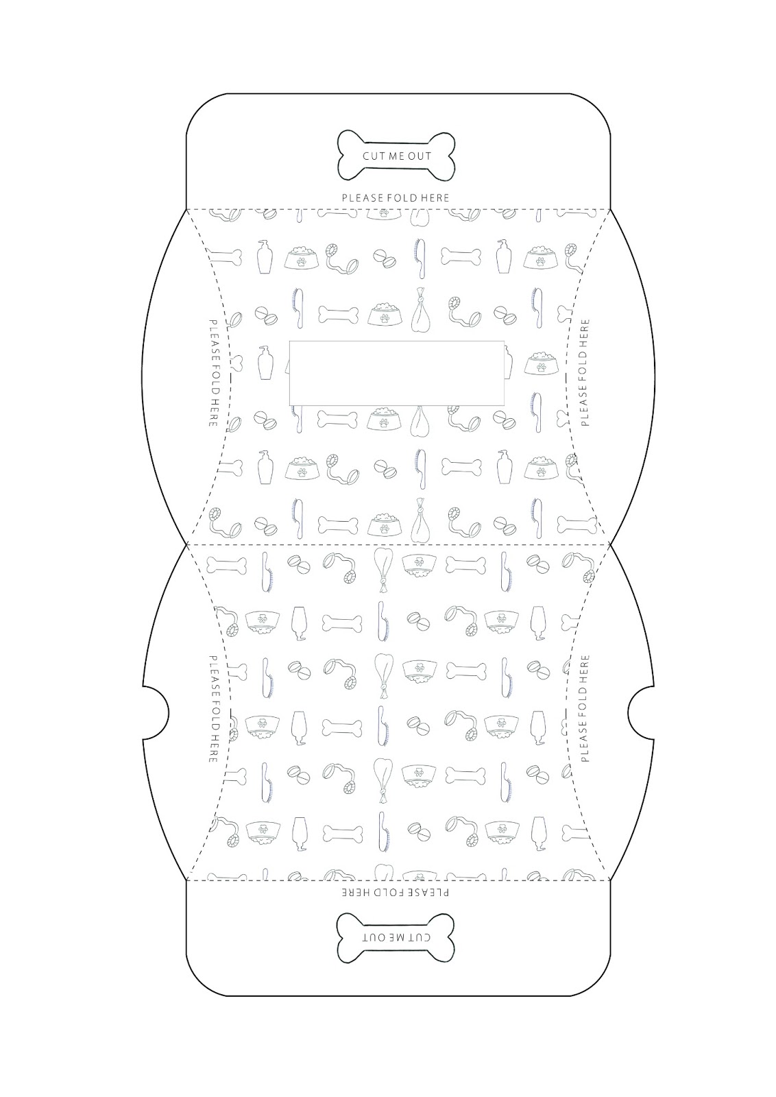
Here are all of the hand rendered nets I have drawn for my final packaging. The reason I drew them by hand is because I wanted the whole product to be as authentic as possible and wanted it all to be hand rendered as much as possible.
Below is the net I have chosen for the disposable bags. I think it is ideal as it has the area with the dispenser in. The area with the bold dotted lines indicates where the packaging should be sealed or glued. This wouldn't be ideal however if I was to design the packaging ready made for people to just fold and seal. I would therefore consider removing them and hope that cardboard would be secure enough for it to stay in place. Even if it didn't stay very well however, it wouldn't really be a problem because they have a lid covering them anyway.
I started to consider the front of the box and the design I visualised for it. I want it all to tie in together as a set, so that the packaging inside fits in well with everything else. This is why I have designed it in this simplistic way, following the same theme, having the pattern printed in the background with the box in the foreground including the product name 'The Pooch Pouch' with the slogan underneath 'Pouches for your pooch'.
I then thought more about the infographics, as this is a crucial element to consider and perfect for this brief. I designed a label which could be applied to the inside of the lid. I wanted to produce something which was as simple to follow as possible, and not time consuming. I feel as though I have covered all of the necessary instructions here.
Having experimented with a lot of different shaped nets for each of the packaging ideas I finally found one which would be suitable for medication. It is likely that dog owners would take medication away in their sealed containers and so this is the ideal shape to be able to fit pills in.
For the shampoo net I needed it to be a simple rectangular shape with the pattern applied to the front and the back of it. Having made lots of varied prototypes this was definitely the most suited to shampoo. When it comes to making my final net I will delete the solid dots along the left hand side as I don't think it is necessary to have them there. The reason for them being there is to give instructions to the consumer to glue that side down, however I am not providing them with any adhesive so this seems pointless, and it can stay together quite easily without having to do this.

I decided to settle on this net for the treats packaging. I have adjusted it slightly however in terms of design to make it more practical. Beforehand, the box didn't close very securely, meaning that the treats could possibly fall out. I have therefore added two tabs with instructions to fold each one over in order to slot into the other side of the box perfectly. This now means that I can simply seal the whole box by using just the one sticker and there are no boxes for anything to slip out.
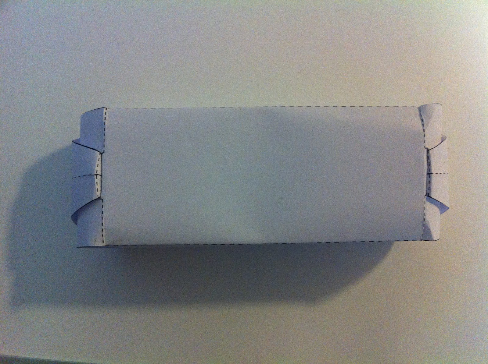
Below are my bellyband ideas for the lead and brush. There are fairly self explanatory to look at, and where there is a solid line there would be a straight incision allowing both ends to slot together. I am pleased I decided to use a bellyband for these two rather than boxes because they are much more flexible, allowing different sized leads and brushes to fit inside.
This is the net for my food container. When I originally made it out of paper I instantly thought it was most suited to food. This is because there is a simple slot in seal at the front which is ideal and can be reinforced with a sticker if needed. Once again, I have applied the pattern to the front and back and have left the sides without, this gives added impact and makes it stand out rather than the whole of the packaging being covered.

Originally, I was going to produce my stickers at home by simply feeding some sticker paper through the printer, as I know that this will work. The only problem with this would have been the fact that I can't get an edge cut out around each sticker enabling me to peel each one away. This is why I decided to enquire about printing in the digital dungeon instead. I had never used the sticker facilities so was interested to know how they go about producing them. Before doing so however, I had to open the individual sticker files in illustrator and align them within the space of an A4 page. I then had to create another layer with all of the circular outlines on, so that I could have each sticker cut out perfectly after having it printed. I then took this file to the digital dungeon and James was able to sort it all out for me. Thankfully, they all came out as well as I had hoped. The design for the brush wasn't as successful, but I think this is because the lines I had drawn for the bristles looked thicker on the computer, but when printed the quality of them was lost slightly. I had a rethink though and actually decided that I wouldn't need to include stickers for the lead and brush anyway, as the belly band would probably be sturdy enough as it is. I therefore decided to cut each column out separately to include in my Pooch Pouch.