For this brief we have been asked to produce a set of five postcards that explore our given shape, mine being a circle. We have to use our shape as the theme and photograph areas of the college to base our manipulations in Photoshop upon. I have therefore been and collected photographs which I could use to fulfil this brief.

Stool in the library

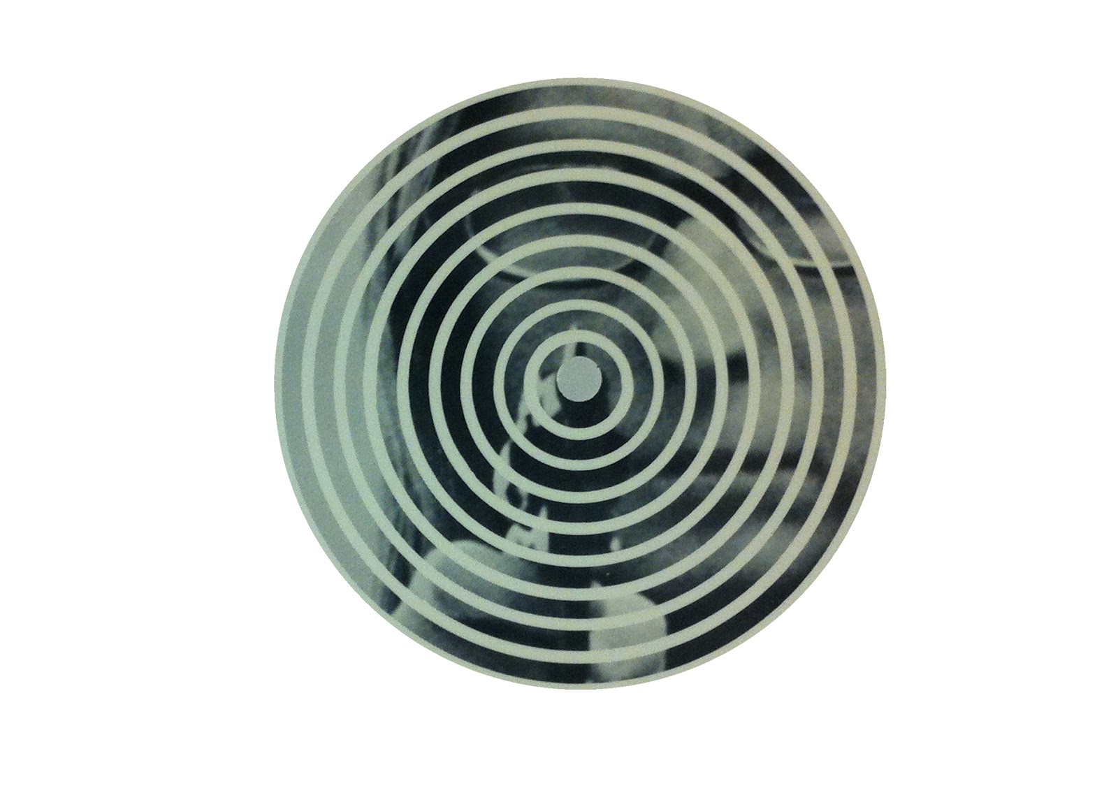
Taken from the cover of a book in the library

Taken from the cover of a book in the library

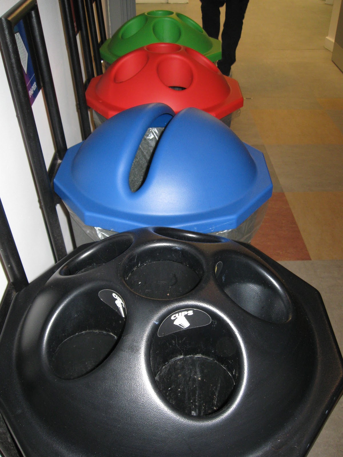
Bin

Sign on doors

Taken from a poster on the wall

Sign on the wall

Sign on the wall

Lock on door

Paperchain

Taken from poster design on wall

Light

Symbol on wall

Mirror in the reception area
Second Photoshop session with Simon


This means that it is a smart object

To make all of the people disappear...

This is the result below after taking a median of what is going on

It has made the sky a bit blurred and not as crisp as it should be so we inserted an image with good quality sky


Continuation of brief work (circles)
Below are my contact sheets of my chosen circles


Lossless - Print
Losee - Web
As a graphic designer we need to be aware of PDF and what it is -
Portable document format
It is a file format that was created to send find via different users
Printers and clients for example


After this session I decided to go round college and take more photographs. I felt that I could do with a broader range of images to work with to ensure I am happy with the end result. The photographs I took are shown below. I would have liked to have found areas within college which subtly formed the shape of a circle rather than taking photographs of obvious shapes. However, I will manipulate them until I am happy with the outcome.


I then used these photographs to experiment with some design ideas leading up to my final five postcards. I am just concentrating on the front of the postcard at the moment as I think I want the back of it to be quite minimal and simplistic so once I have perfected the front so that it is exactly how I want it to be, I will then complete the back of it.
I have completed a selection of drawings to get some design ideas down on paper before starting to work digitially.


I had taken a photograph of some artwork which I found in one of the corridors in college. Using the photograph I took I enlarged it to fill the space on an A5 page to make the circle in the middle the focal point.

I then tried to see what it would look like if the focal point was highlighted in a different colour. I am not overly happy with the outcome of this design however, as I feel it lacks skill and isn't as striking as it could be.

Here I have simply layered the image up by placing a circle over the image and reducing the opacity. I like the effect this has as it highlights the shape I have been given to use for this brief.

I then removed the area around the circle to create negative space and to create a more minimalistic idea.
This design is quite self explanatory as I have just highlighted one area again to create impact and to define the shape.

I originally thought when I photographed this area of college that it would be interested to highlight the letter 'O' in all of the words. Once I had manipulated the image to be black and white however it proved harder to do as it looked unprofessional and unnecessary. The outcome below is therefore not very fitting with the circular theme but I quite like the angle of the image and think that if I run out of other ideas this could be one that I resort back to.

Here I have simply used the circular selection tool to copy the pattern within the artwork I found in college. I really like the use of colours here and think it is quite a striking image.

I worked with this image further and made a pattern with the moon in the background faded, I like the effect this has on the central image but I am not as keen on the outcome of using it as a background as I think it looks too busy and there isn't a clear focal point. The image itself looks too washed out.

Although the colours are still fairly washed out I prefer the circle on its own. Before settling on this idea I am definitely going to experiment more.

I have duplicated the pattern within the circle to fit the background of the postcard. I really like how this has turned out, however the colours could still be more striking.

This is what the same postcard would look like if the image was inverted.

I wanted to see whether it would be worth using any of my other photographs so I have chosen to use this one of the light. I tried to incorporate the pattern to fill the shape of the light but it really doesn't work well as an image in my opinion.


Here I have added another layer by introducing the photograph of the wall outside of college which has a circular space on it. I think it looks too busy and is an unneccessary addition to this design.

Here I have used a close up image of one of the recycling bins in college and have put the black and white versions of the circe on top. This doesn't work very well but I am glad I have experimented to allow me to realise where the strengths and weaknesses lie within each design.

I have incorporated another image in this idea which is shown below. Having taken lots of images of the circular bolts around college I thought it would be interesting to see how they would turn out on a postcard. Visually they aren't very intriguing, however if they were used in the right context they could make some interesting postcards.

I prefer the image in black and white and like how the focus is on the circles and the metal pole down the middle with the background also creating some interesting shapes.

By combining two different images and playing around with the composition I came up with the following image. I didn't spend much time on the layout but was interested to see whether I could merge two images and have them working successfully in conjunction with one and other. I feel that it works to an extent but it is too busy for my style. I much prefer minimalistic, clean designs.

I prefer the outcome of this one as it isn't as busy.

I have gone back to working on the design which I feel has the most potential and a better chance of being successful. By putting an image of a light behind it I have been able to add more texture to it.

Here I have enlarged the texture of the moon and stretched it to fill the background. I have also selected the four smaller circles to put either side of the main one to see what this would look like.

Eliminating the idea of having a textured background I thought it would be more much professional to simply use the eyedropper tool to pick out the main colours from the pattern and fill the background with it.


I used one of my original photographs below and put it behind the design to see what effect this would have, and again it wasn't really needed as it didn't make a great difference.

Here I stretched the design to fill the background and I am fairly happy with the outcome of it but still feel like a block colour does the design more justice.

The idea of highlighting the image in the centre works quite well but the overall image looks quite drab.

Even after altering the opacity of the background layer I am not satisfied.

As I need to produce a variety of five different postcards I have considered using the same design but outlining each one with a different colour to make it stand out more.


After looking at all of the different ideas I have produced I feel that this is the strongest so far. Although it is simple and hasn't got much to it I think it is eyecatching and enough to make someone pick it up as a souvenir or an interesting piece of design to add to a collection. The one thing I did notice however was that I had reduced the opacity too much so the image had lost quality. I therefore decided to change this and strengthen the colours so that they were more vibrant and so that I would be able to pick out some bolder colours for the backgrounds. I think that maybe the design could do with some text on it somewhere but for now I am happy with it looking this way. The text I would probably include would be something simple like 'Leeds College of Art'. Enough to give the recipient a taster for the institution.


Final five ideas and preferred colours for backgrounds...


Possible back designs (with front to get an idea of final postcard)


Below are my final printed postcards. I am really pleased with the overall finish of them and the colours have printed just as I had hoped. I was concerned that the colour may lose quality after print but it has actually maintained the quality and works really well on the stock too.


No comments:
Post a Comment