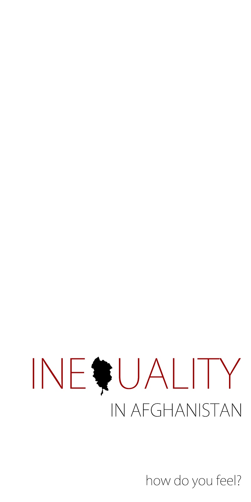
Our brief is to produce designs for a set of three high impact posters that deliver a personal identified message derived from our research. The posters should work as a set or series and be visually consistent.
- The first must be produced solely using type
- The second solely with image
- The third a combination of both

I have decided to concentrate on the image of Sharbat Gula. This is because I find the image of her extremely striking and powerful. When I researched further about her I found it interesting to find out that the photographer who originally took her photograph had gone back to Afghanistan and found her. She was clueless about just how famous she is here and all over the world. This is because she is so disconnected where she is in the world and is living in poverty.
This then lead me to think about poverty and inequality and how unfair it is that the photograph of her is so well known and worth so much money whilst at the same time she is living her life in poor conditions. In some ways I feel that she deserves a portion of the money that the photograph will be sold for because if it wasn't for her it wouldn't exist.
The cost of living compared to the amount the photograph is worth would definitely be worth looking at and considering when trying to come up with an idea for this brief. Therefore I am going to continue with my research on my design context blog.
Design Process
I have started to think about my ideas by brainstorming potential ideas. I have separated my ideas on separate pieces of paper for image, text and image and text.


I then started to think about the layout of my text and how I could experiment with composition.

We have been asked to complete 20 designs for each poster. I found this really helpful as it not only helped me get all of my ideas down on paper but it also helped me to see my faults along the way, allowing me to make improvements.
20 examples of posters with image alone...
I experimented with using scales to illustrate the imbalance between Sharbat Gula's life and everyone else in the world. I then thought about highlighting the less developed countries in the world by having them blacked out and the more developed countries would have symbols to represent money and wealth.

Below I have developed the idea of using symbols to represent wealth, health and good living. I also thought about zooming in on the image of Sharbat Gula's eye as it is such a memorable and striking image which most people can relate to. Another idea would be to illustrate parts of Sharbat's face breaking away to the rest of the world to show how famous she has become and to illustrate that anywhere else in the world she would be recognised for her photograph.

The designs below are fairly self explanatory as I have developed upon previous ideas. I think that although the idea of using her eye could potentially be very successful, it may be hard to produce in a way that everyone would understand what I am trying to say.

I also considered using photographic images of the photographer and Sharbat to show the inequality between the two. I would also use scales overlaying the images to reinforce the message I am trying to portray.


20 examples of posters with text alone...
I firstly drew some simple ideas to show where I could place the text on the page.


I thought about trying to combine the two words together by linking them with the same letterform (as shown in the drawing on the top left hand side). I think it looks too imbalanced though because the word 'inequality' is much longer than the word 'banish'.


20 examples of posters with text and image...
I found the text and image designs easiest to do as it is helpful being able to use text to compliment the image and make the message easier to understand.


When looking at all of my designs I thought it would be interesting to create something which involved Sharbat Gula's face. I firstly drew a basic outline of her face and then I drew the outline of Afghanistan and put it around her face to form her clothing. As a line drawing it is obviouslt very hard to distinguish what the image actually is.

Image alone
I scanned the image in and on Photoshop I simply filled part of the image with black and by doing this I think it looks much more effective.

As an image alone I feel that it doesn't quite portray the message of inequality yet. So I added a tear to the design and I think this gives it added meaning.

I started to play around with the layout of my image poster. I used a file the size of 240mmx120mm. I like the simplicity of having it placed in the top left corner but think that it is maybe a bit too simple and plain with only black and white being used.

I experimented with a red background but I don't think it is very effective and it almost detracts from the image. I feel that the image should stand out more than anything else.

I then tried enlarging the image purely in black and white and I also felt that the teardrop was a bit too perfect and needed to be a bit rough around the edges so I handrendered one and scanned it in, similarly to the rest of the image.

I really like this one. I feel that it is striking and definitely captures attention. I will most probably come back to this idea and develop it further.

Text and image ideas
I thought it would be worthwhile to try out some more of my initial ideas which I had drawn out. I therefore drew a rough globe and some scales to apply to some more designs.

Below I have obviously used the globe and hightlighted Afghanistan in red. I also played around with the text a bit and highlighted 'equal' in red so that it stands out from the rest of the poster. I think the lowercase lettering at the bottom is also effective and it separates the question from the rest of the and because of this is captures attention.

This idea is very minimalistic but I quite like it. The subtle illustration of unbalanced scales work well in conjunction with the typography.

I then started to work on something which was a bit bolder and not quite as subtle. However I strongly dislike it because the text looks unprofessional and it definitely takes attention away from the illustration in the centre. Another thing I am not happy with is the composition as it looks too boring having everything aligned in the centre. The one positive thing I will take from this idea however is the use of a red tear. I think it is a very simple and thought provoking way of portraying the message of inequality.

I feel like this is a huge improvement. Rather than using Impact I chose to use Kozuka Gothic and I think it works well. It may however be slightly too faint but I can overcome this problem later on when I settle on final designs.

This idea is very similar apart from the fact that I removed the word Afghanistan, which I now feel is definitely a neccessary element to the design if it is to make sense to people.

This is therefore a much stronger design idea and I am beginning to feel a lot happier with where my progress is taking me.

This is a completely different take on the combination of type and image and is a lot more subtle. I am still not keen on the use of Impact but like the concept behind the idea.

The combination of the two fonts really doesn't work well at all.

I love the choice of colours, the font and the layout of this idea and would possibly consider it for one of my final posters.

I tried the same design but with a grey tone for the outline of Afghanistan and it most certainly loses quality. The red is much more striking and powerful.

This idea reminds me too much of a book cover so I think I will stay away from composing my designs to be central.

The way the word is in red makes a huge difference and ties the text in with the image. Allowing there to be a meaningful link between the two. Red to me in this case represents anger and hurt which is how Sharab Gula felt when the photograph of her was taken.


Text alone
Text alone is probably the most challenging poster to produce as it has to speak for itself without relying on the image to help explain the message. I have started off designing very simply as I think in this case, the simpler the better. However I am unsure whether I am at risk of it being too minimal and maybe in need of some factual typography.
Text alone is probably the most challenging poster to produce as it has to speak for itself without relying on the image to help explain the message. I have started off designing very simply as I think in this case, the simpler the better. However I am unsure whether I am at risk of it being too minimal and maybe in need of some factual typography.

I much prefer the black background as it is much more eye-catching however I am glad I have experimented with red as I can now more forwards with my ideas.

I started to put type around the outline of Afghanistan but as I was doing it I knew that without having the image in the centre it wouldn't be so dramatic and it was hard to form the shape with such large text as it appeared to be too spaced out. I could have continued developing this idea and used a smaller typeface which was closer together but I already felt like I didn't like where this idea was going so it would have been pointless. Definitely one of my weaker ideas.

This idea takes minimal to the extreme and I feel that it is too basic and there is not enough there to portray the message I want.

Below are a couple of screenshots from when I was developing my next idea. As my previous idea of forming the shape of the country with text didn't work, I thought I would instead fill the land mass with facts to form a more definitive shape. I originally used Kozuka Gothic and then experimented with changing it to Helvetica because I needed a bolder, more striking and legible font. The facts that I used were taken from the following website.


I then applied the Kozuka Gothic idea to a poster design. I feel that it loses impact on a white background in some ways though.

I changed the text to black and white to see whether it would make a difference but it didn't really.

I then completely adjusted the design and tried using Helvetica for all of it. I wasn't completely satisfied however and still prefer the other font for the main typography on my poster.

I did the same here but with Kozuka Gothic.

I tried enlarging the text to see whether it made more of an impact but still didn't feel satisfied.

I am much more content with this design as the type all works well together and the two fonts actually complement each other really well which is what I was originally concerned about.

Just as an added experiment I tried repeating the sentence 'Inequality in Afghanistan' just to see what it looked like but it was much less appealing than my previous idea.


I thought I would experiment with a play on words idea. From a distance this poster would look like it said Inequality in Afghanistan but close up it can say two different things... Improve inequality of life in Afghanistan, or Improve quality of life in Afghanistan. This wasn't as successful as I thought it could be but I enjoyed playing around with it to see whether it would work or not.

Again this is one of my more minimal ideas which I am not very keen on. I definitely prefer the ones with more typography on.

Final poster designs ready for class crit
Below are, in my opinion my three strongest designs. I am really happy with the outcome of all three but I am sure there is a lot that could be criticised about them. Especially for people who don't know Sharab Gula's story. I thought however, that if people didn't know what the image was meant to represent then it is likely that if they asked someone else they knew they would have an idea and be able to inform them. The aim of my posters is to engage with the audience and make them think about what each poster is trying to convey. They work together as a set which was also something I thought about as I feel that it is important for them to be widely recognisable and if the same or similar type and image are on each one then they will become memorable to people walking along the street. Also, for the people who may not understand the image as much, the ones with text on should hopefully give them an explanation. This would allow the image alone poster to stand alone and be just as successful.


While I was in the studio doing some final tweaks to my designs before printing them, I looked closely at each one to see if I could pick on any obvious faults. I realised that the text could definitely afford to be bolder in order to create more impact and so decided to duplicate each text later on Photoshop to form a thicker font as I don't have Kozuka Gothic in bold on my computer. So the following images are the ones which were printed. I am really glad I noticed this, as I feel like it has made a considerable different to the readability of the posters.


Application
Just out of interest I wanted to see what my designs would look like if applied to a real life situation. The text and image one would probably be the most successful.


Here are my printed designs ready for tomorrow's crit!

No comments:
Post a Comment